Offrange writers produced some excellent stories in 2025, ranging from the thoughtful and compelling to the heart-breaking and dramatic. That said, in journalism, we so often focus on the words at the expense of the visuals. But our designer Adam puts considerable care and attention into designing original artwork for every Offrange story; our inbox is filled with reader praise for his work. We also have commissioned some original photography that turned out quite nicely.
So this year, in lieu of a traditional “Best of 2025” roundup, we asked our regular writers to share their favorite Offrange art from the year. Enjoy!
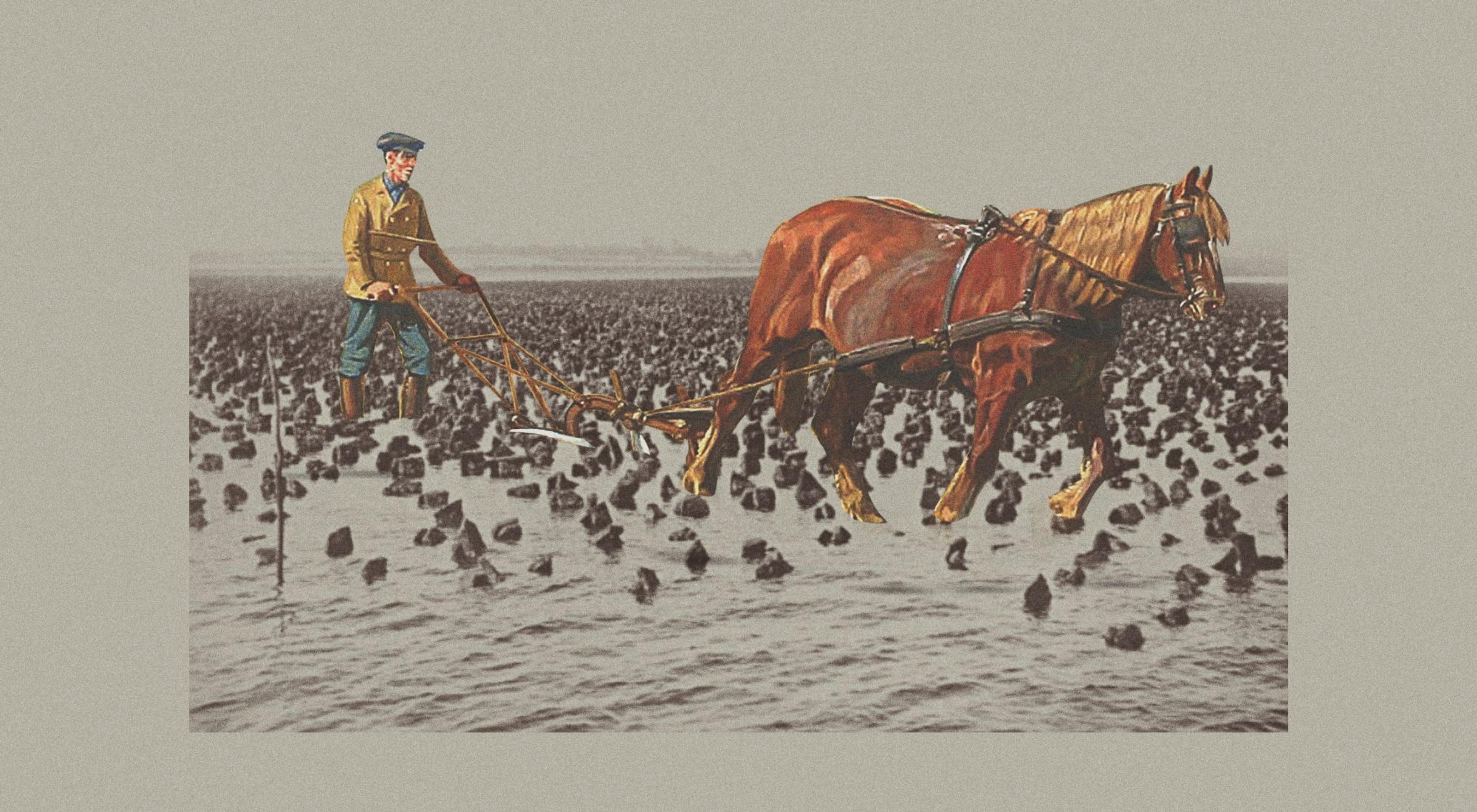
Bringing Oyster Farming Into the 21st Century
I really love that the aesthetic for Offrange stories leans to looking a bit older and timeless instead of prompt, like breaking news. The art does a good amount of work in helping the reader register that these themes and conversations remain evergreen over time, and that agriculture is a cyclical sector connected to generations of knowledge and conversation.
Evan Carpenter
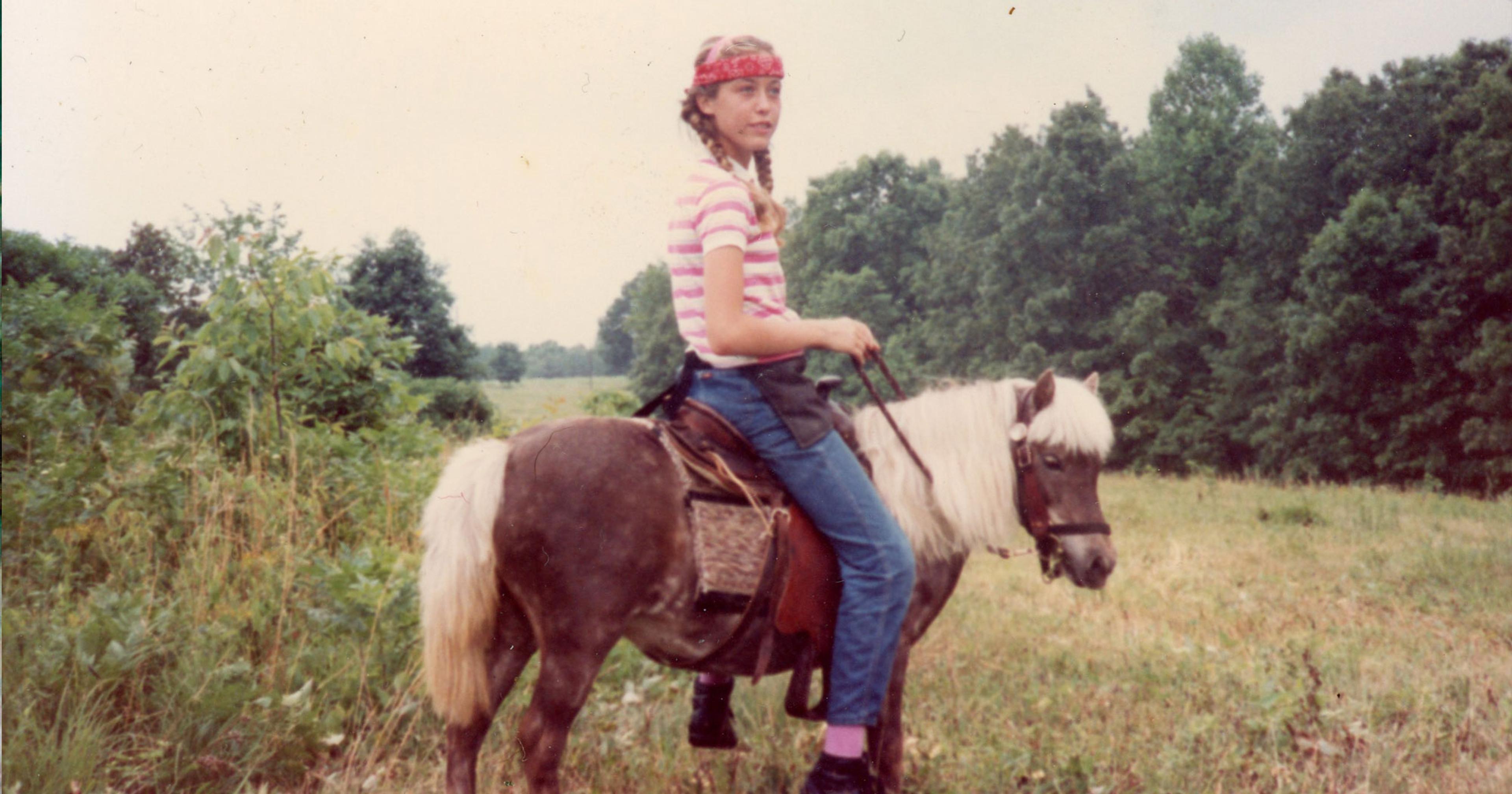
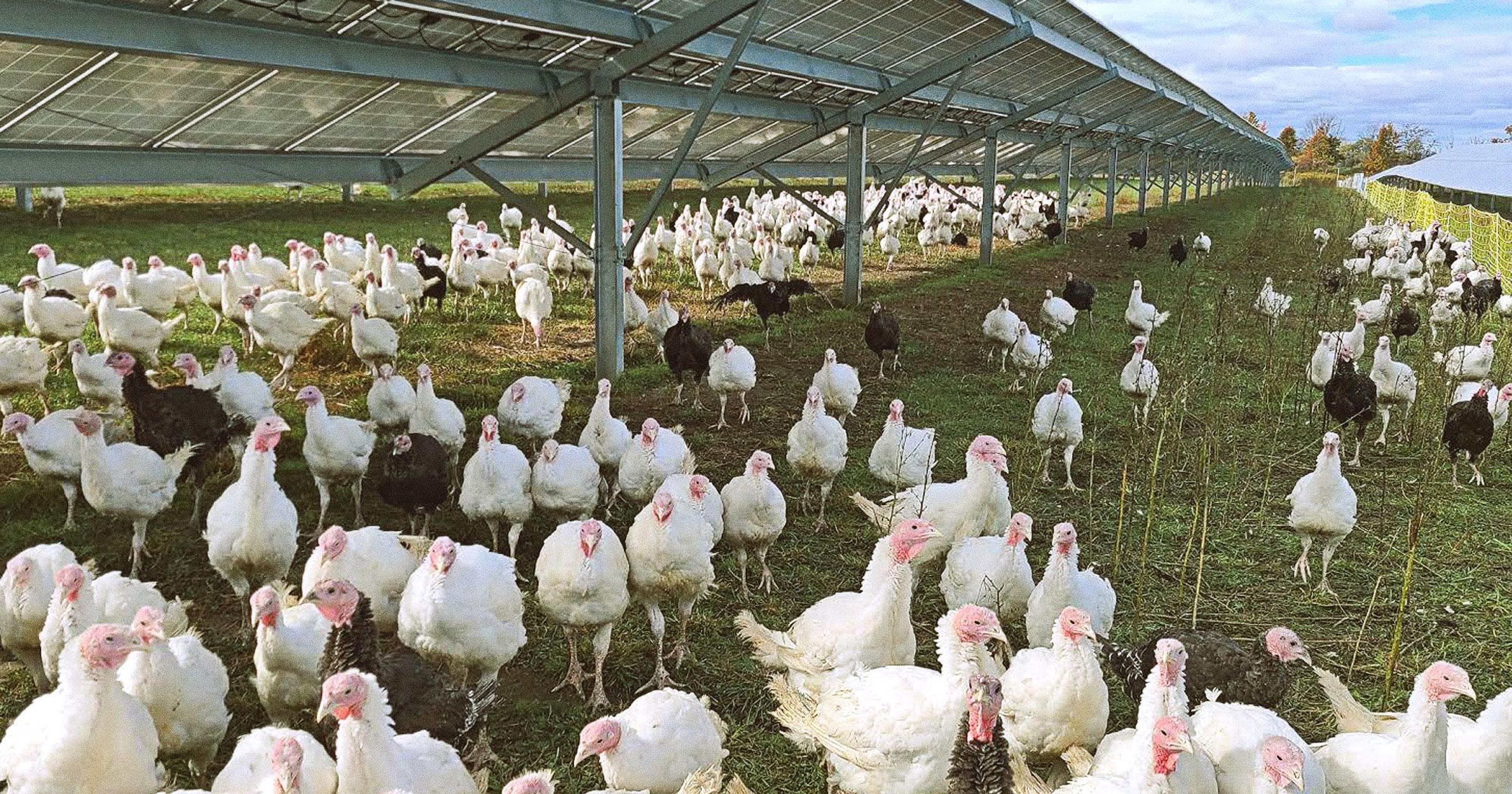
Turkeys Grazing Under Solar Panels
I love the photographs in the article “Turkeys Grazing Under Solar Panels” because I admire their composition, and they perfectly represent the story’s content. They also grab readers‘ attention since they depict an unusual scene.
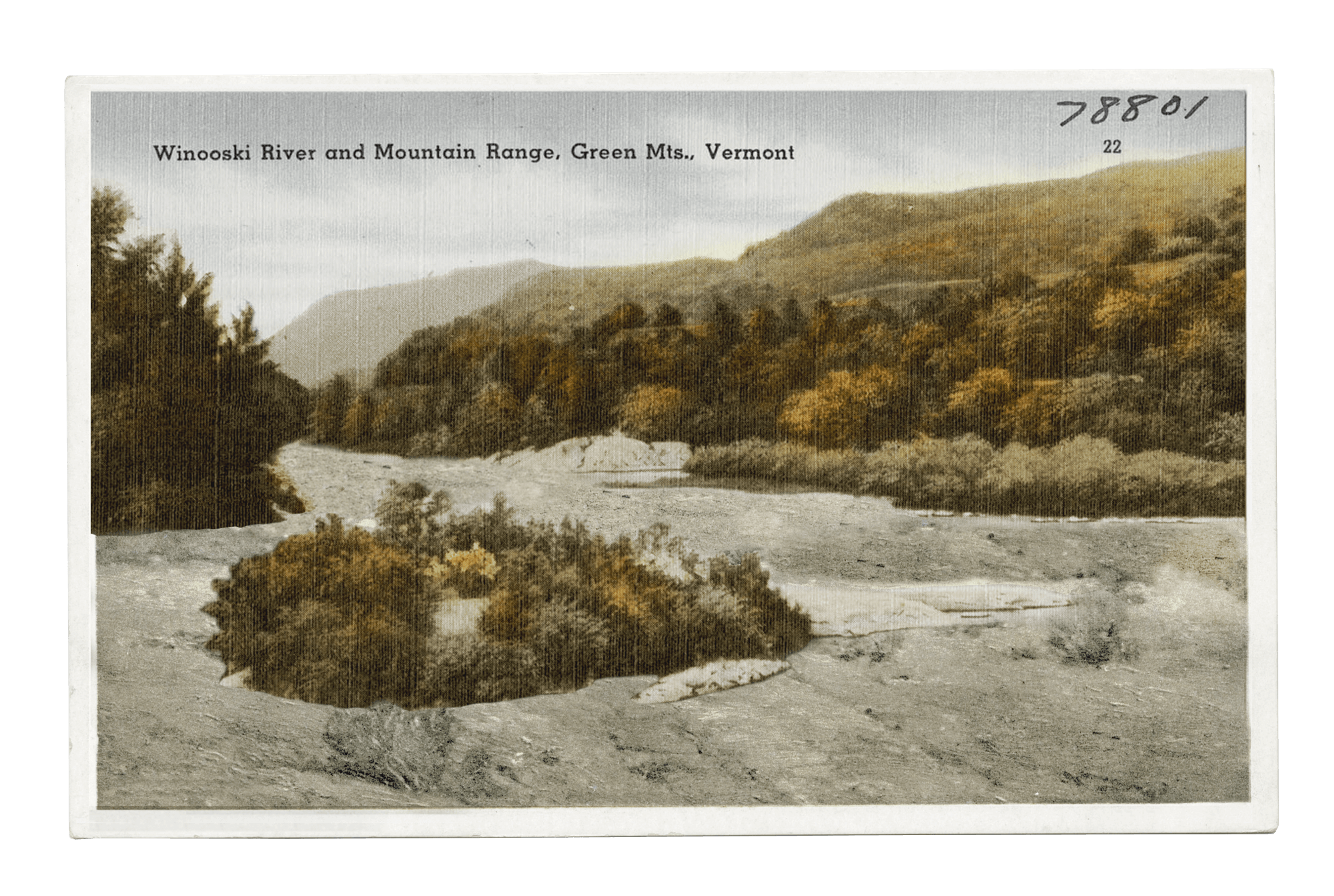
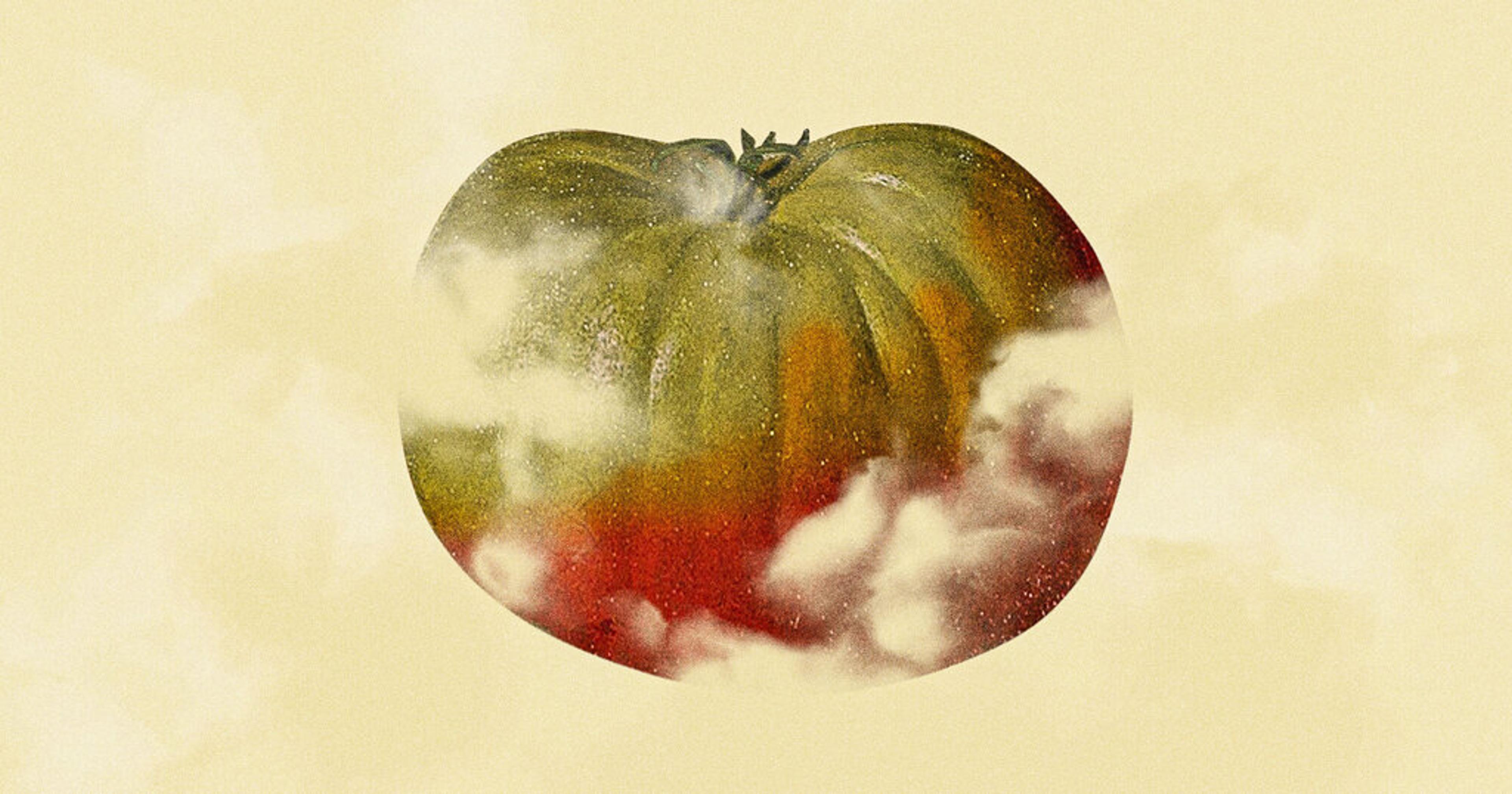
Floods, Then Floods, Then More Floods, Then Drought
This is such an important article about the critical interaction of climate and agriculture and the art has an antique tinge to it that makes me think about the time before climate chaos. It features water, which is the crux of the problem so many of us farmers are dealing with right now, and which is only getting worse. The art shows the natural beauty of Vermont and the USA, which is something most farmers and most Offrange readers presumably want to protect.
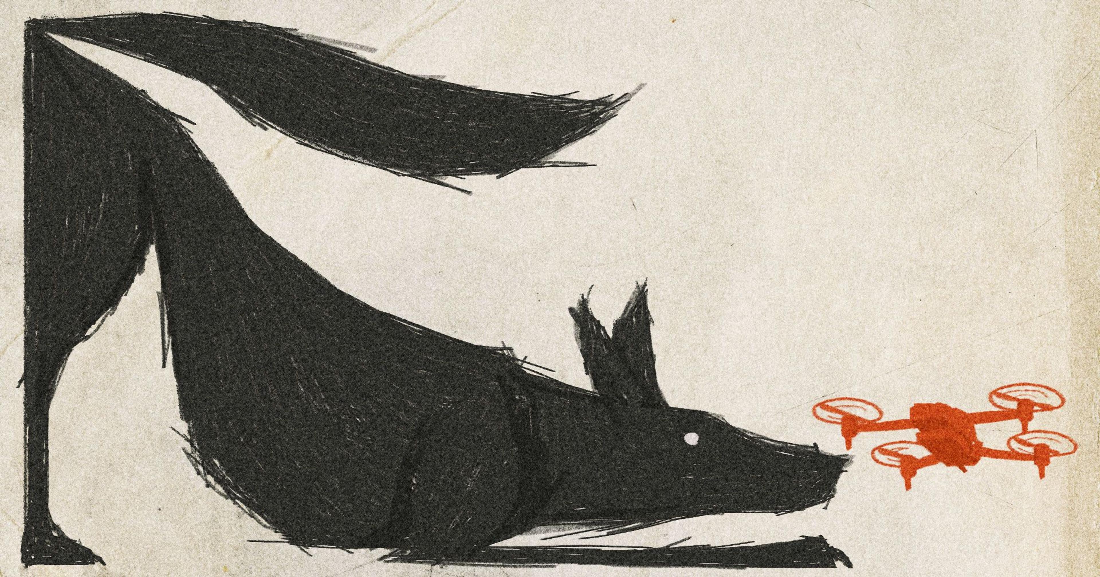
The wolf is one of man’s most archetypal foes, a figure of real danger to livestock and storybook menace alike. The stark, elemental color palette of the illustration here evokes those deeply rooted feelings. And the stylistic contrast between the quick-sketched lupine and photorealistic quadcopter highlights the way some are trying to assuage those instinctual fears through technology.
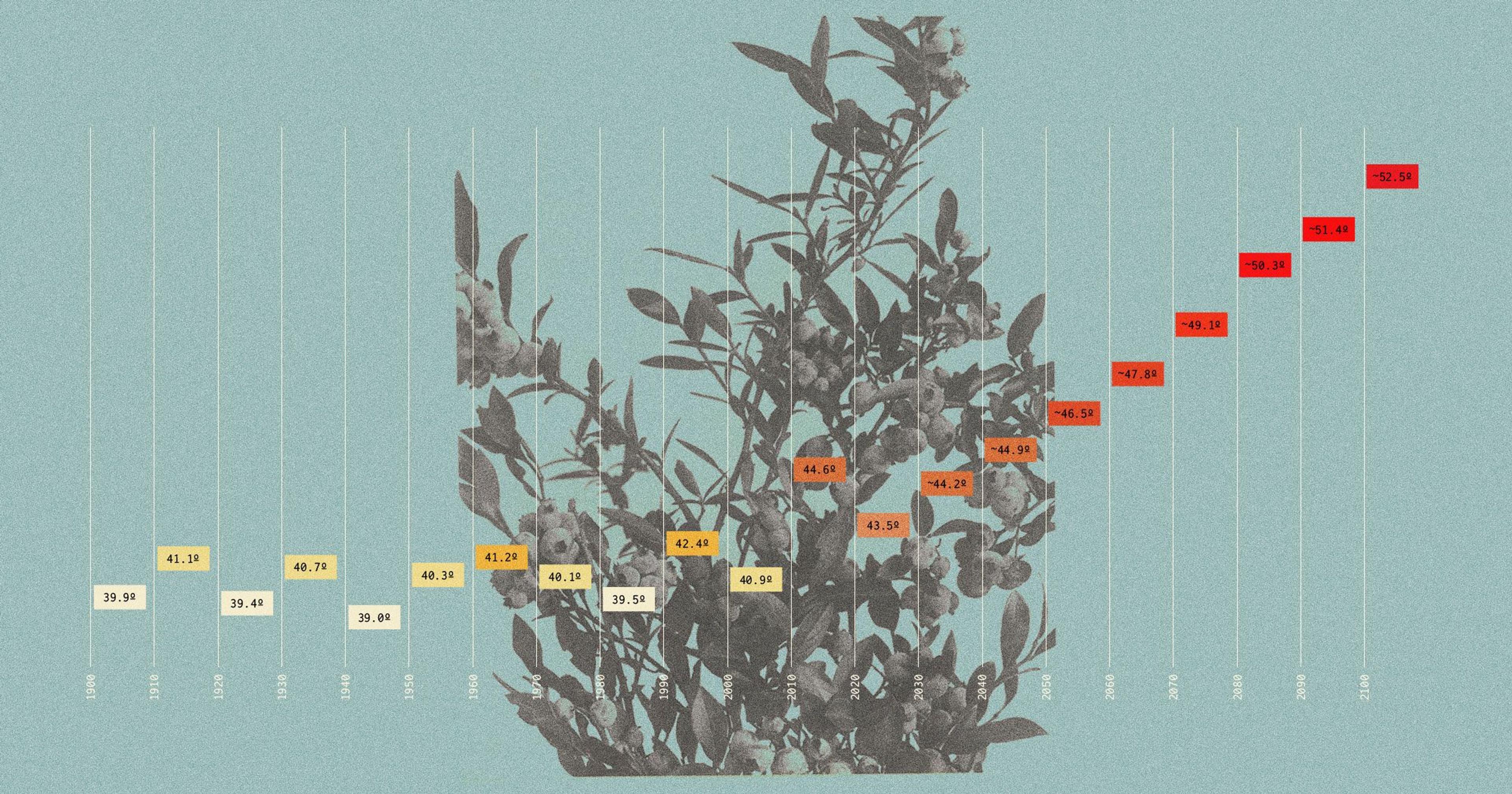
I’ll pick Ben Seal’s “Black and Blue in the Barrens” piece from August. I’m a huge fan of Adam Dixon’s illustration style, particularly the fusion of natural images and data that he often employs. The header art for this article exemplifies how effective that juxtaposition can be. The organic reaching of the blueberry bush and the orderly march of the climate graph complement each other both conceptually and aesthetically.
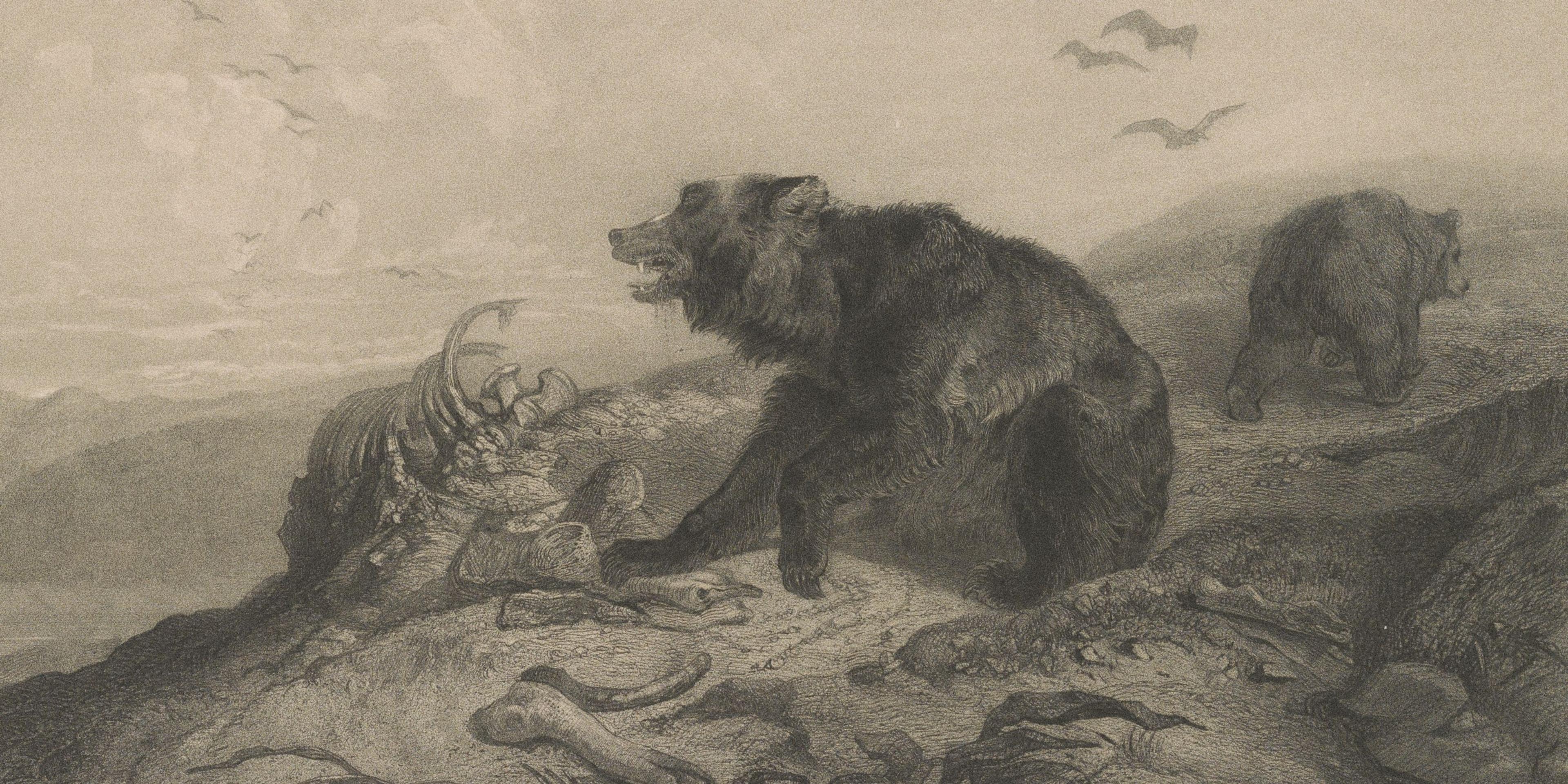
“Bears in the Boneyard” has to be my favorite cover art from this year! It’s so dramatic looking, so historic and fits the article so well, which has some historic talk about predator fears in the West... (I’m trying to think of something more intelligent to say about why, but visually it is just a very appealing artwork to me!)
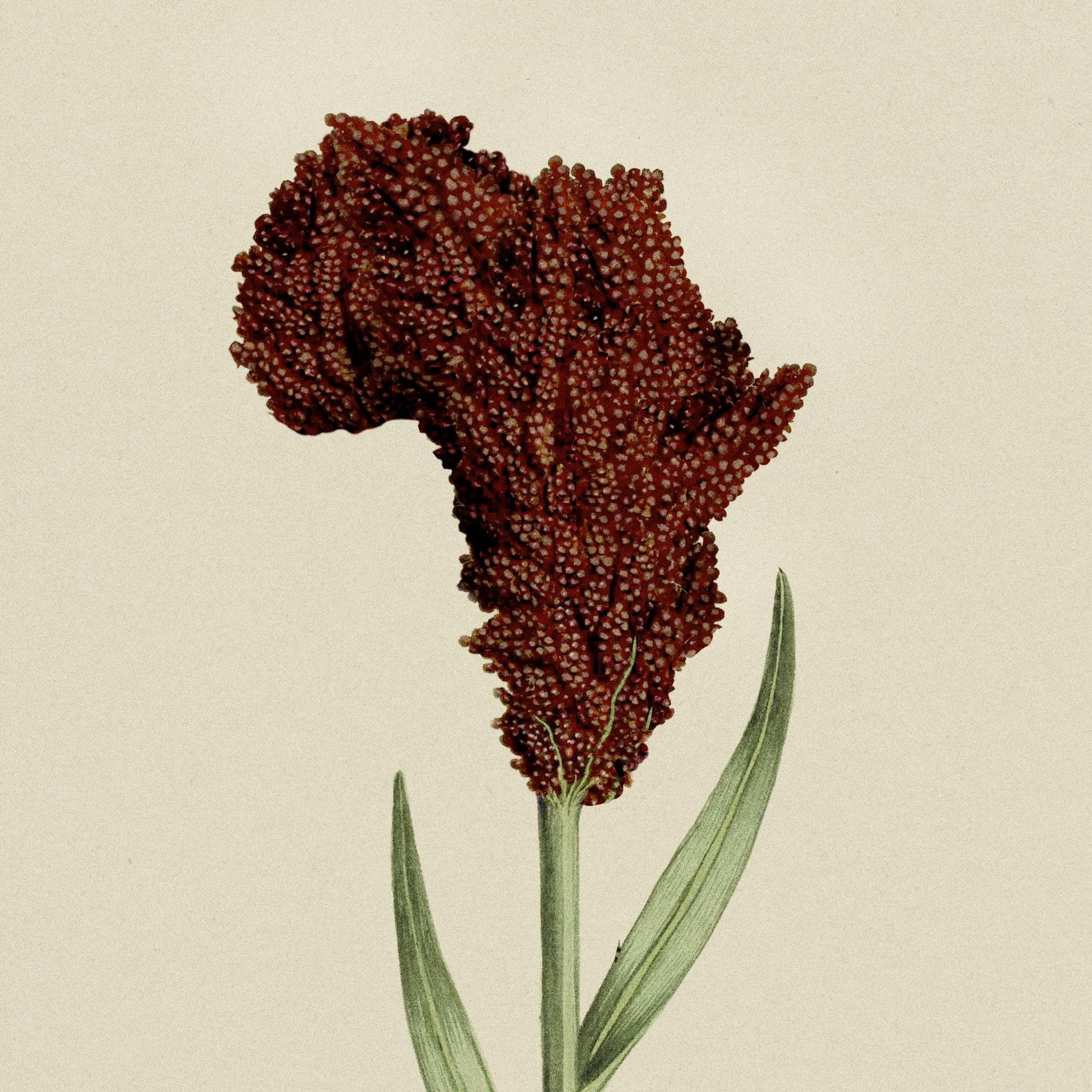
U.S. Sorghum Farmers Look to Africa
I love the art that accompanied the sorghum story. I just think it’s gorgeous!
Christina Yergat
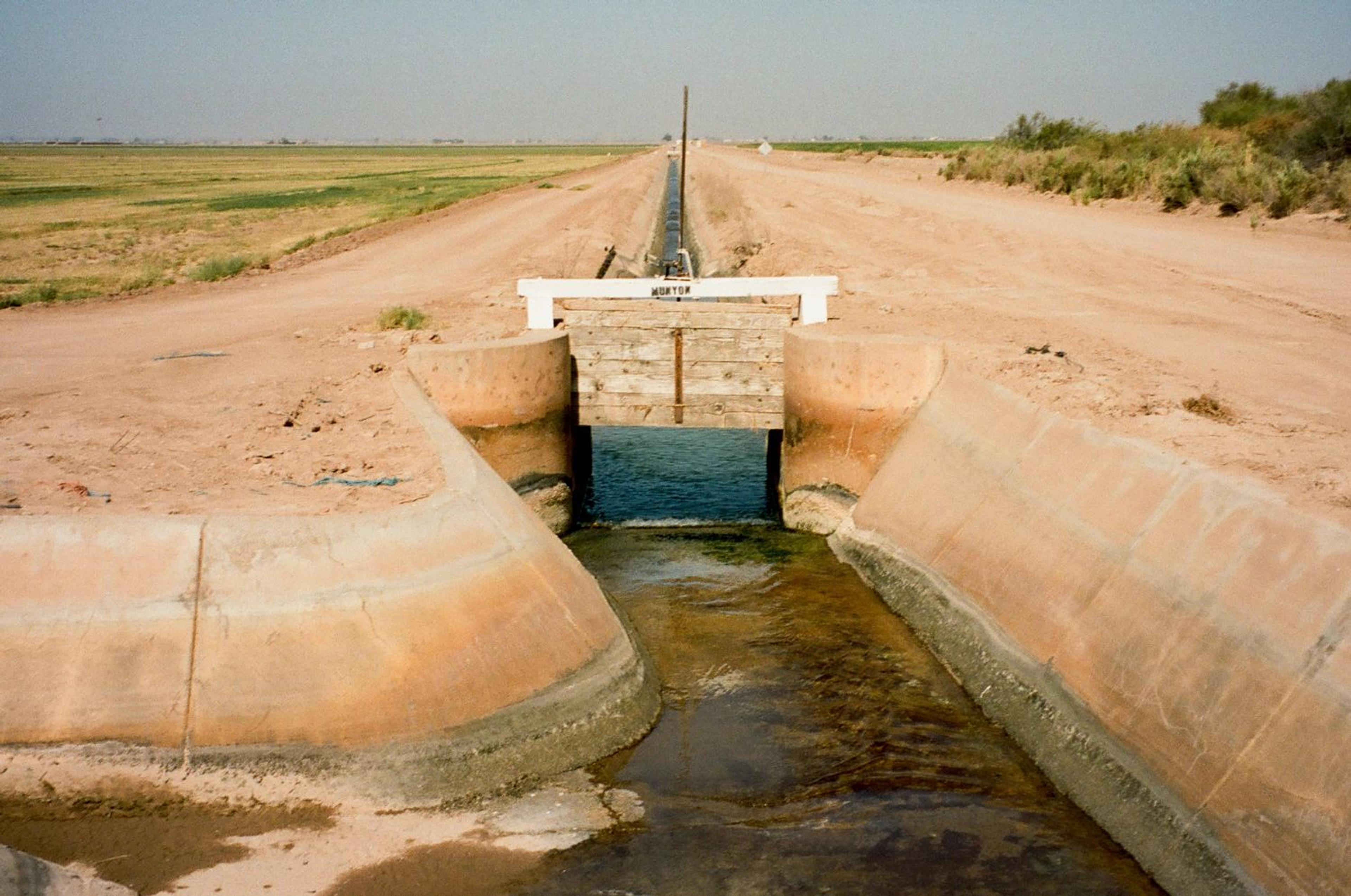
I really loved the original photography in the Imperial Valley feature. It’s got a kind of epic feel. The photos (especially the landscapes) have a gorgeous sparseness and austerity that helps convey the mood of the story. The washed-out color palette of denim blue and sandy brown make you feel the baking heat. And they do that difficult photojournalism task of telling a story without being overly literal (i.e., simply illustrating what the writing itself is already telling the reader).
So many stories about the food system are really about how we use our land. Christina Yergat’s photos of the Imperial Valley, taken for her story with Carina Imbornone about that agricultural region’s looming lithium mines, made that reality immediately clear — in sun-drenched style. Even though I’m a words-first person, these photos reminded me how valuable it is to see change with our own eyes.
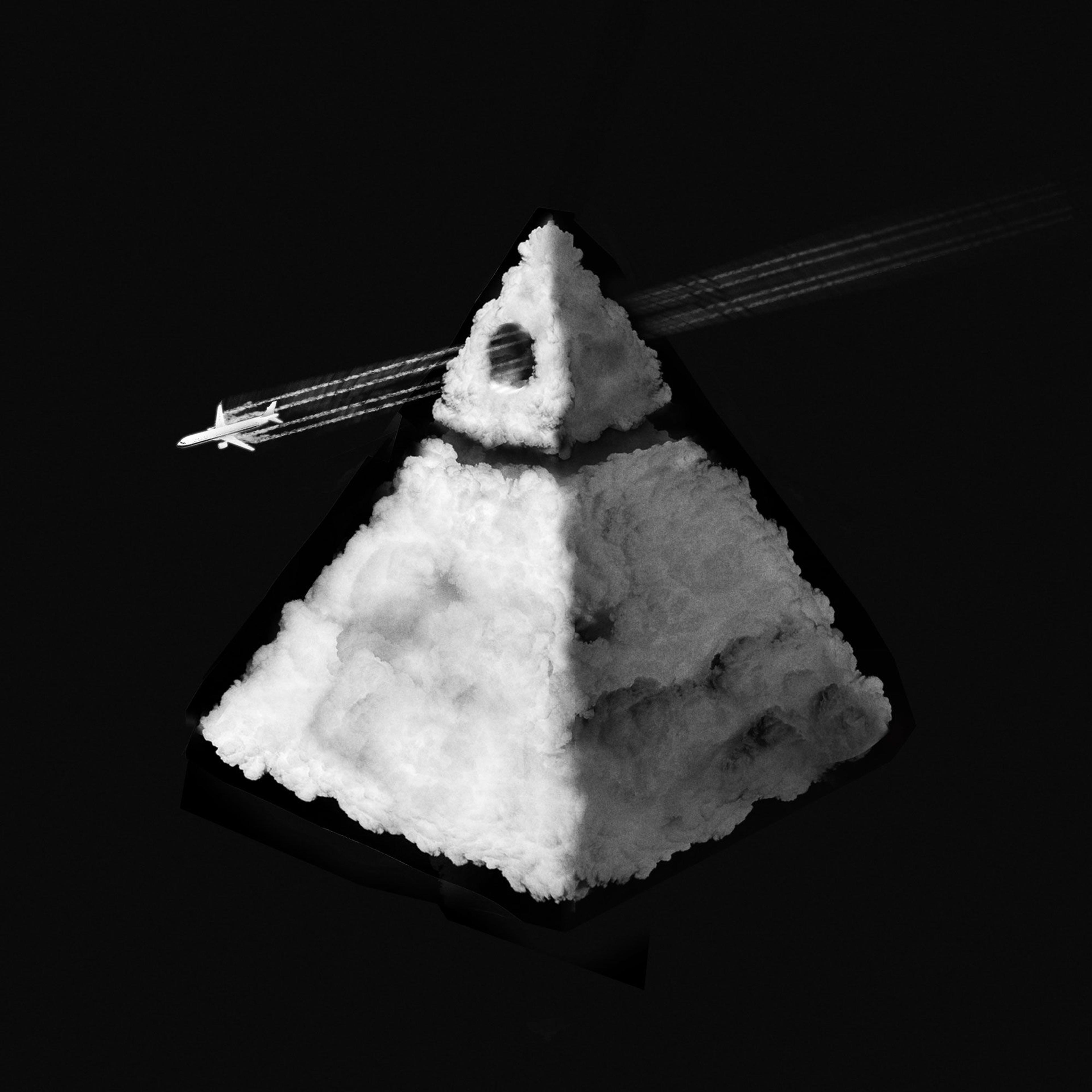
Changing the Weather Is for Farms, Not Evil
Love all of the art and illustrations, but if I have to choose one I’d say my story on “Changing the Weather Is For Farms, Not Evil.“ The graphic perfectly captures the idea of chemtrail conspiracies that’s been linked to cloud seeding, while also being reminiscent of the Illuminati. It’s very tongue in cheek — sometimes with a story like this, it’s good to have a little fun!
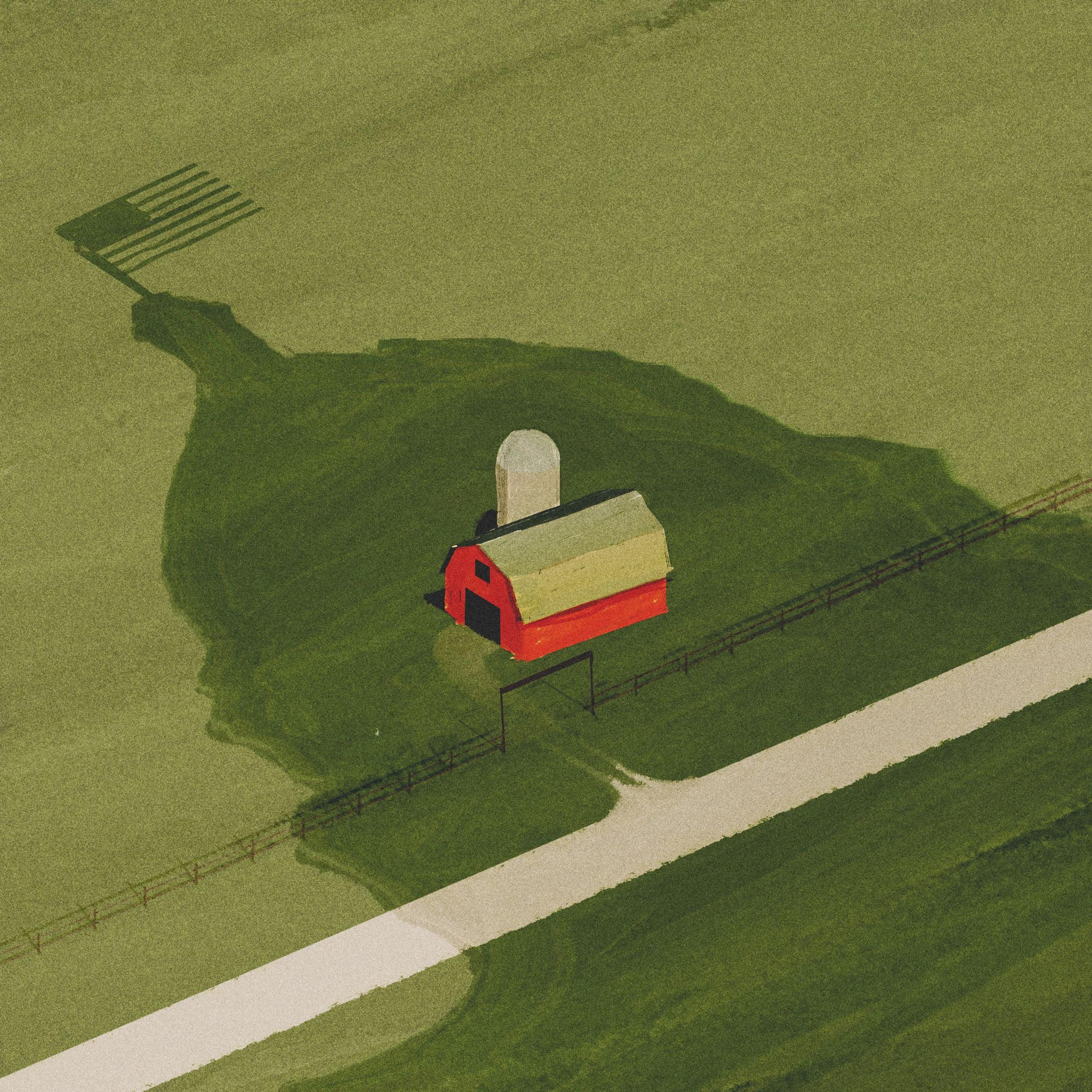
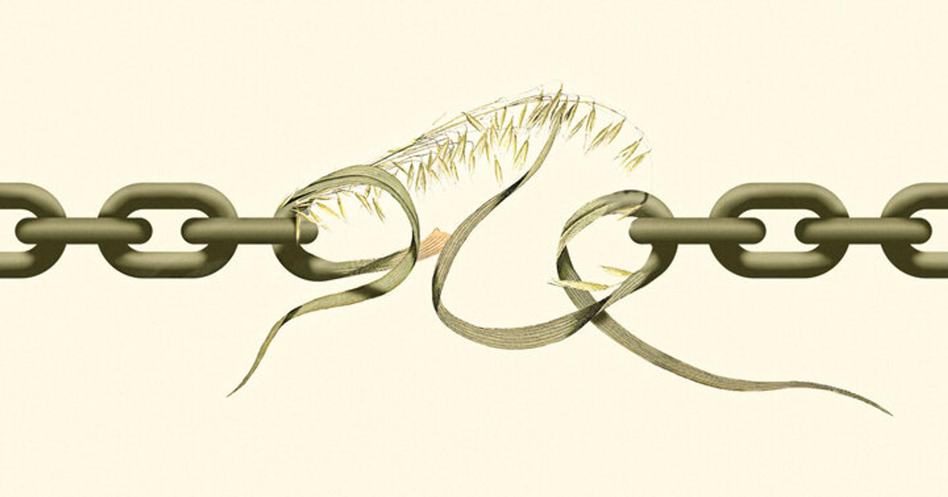
Adam’s graphic on my eminent domain piece was fantastic. He perfectly captured the shadow cast by the government on farms when eminent domain laws rear their head, and it was simple artwork, in a way, but so poignant and striking.
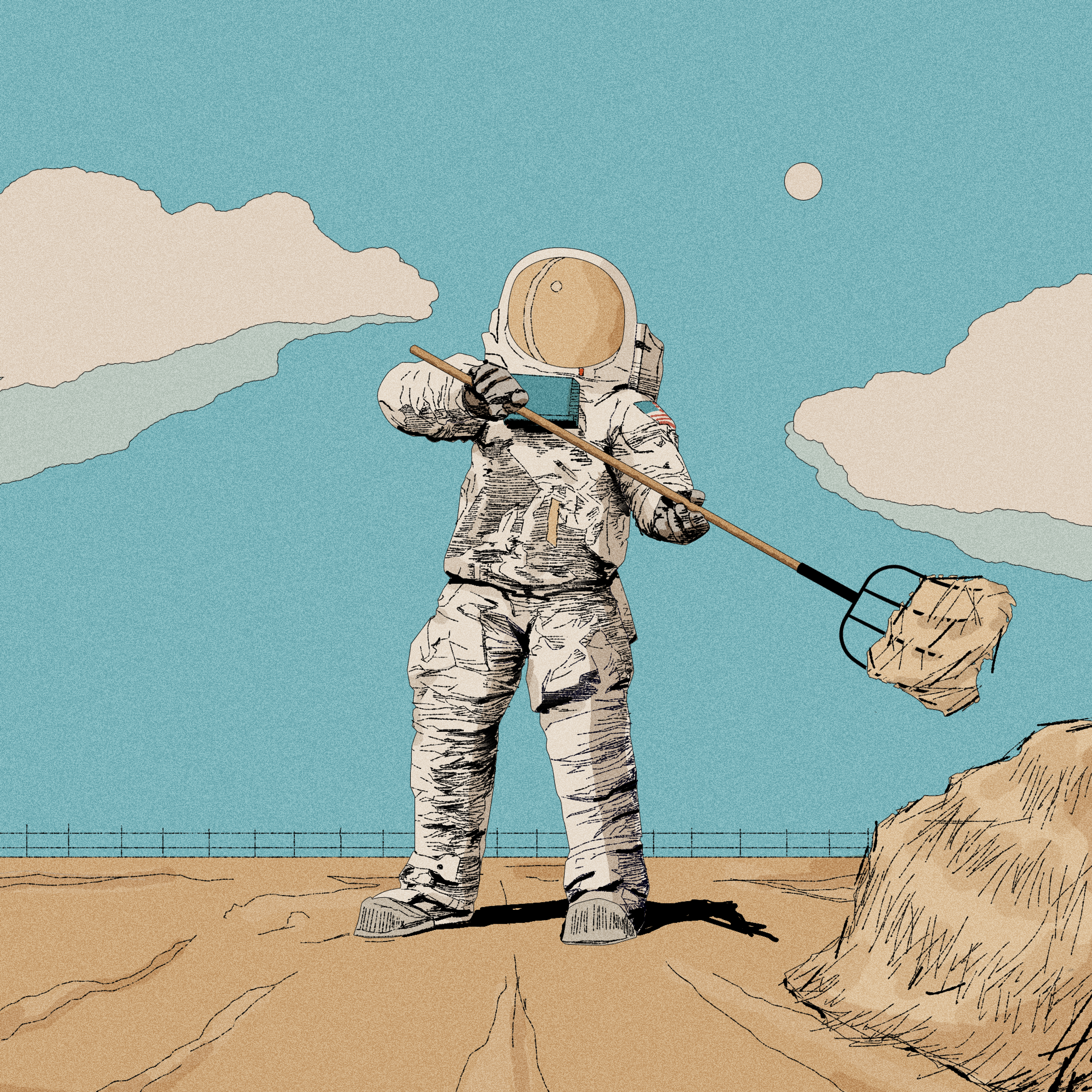
If You’re a Farmer, NASA Wants a Word
I loved the art on my NASA story from earlier this year. The astronaut with a pitchfork in hand was super cool and captured the unexpected nature of the space agency’s partnership with farmers.
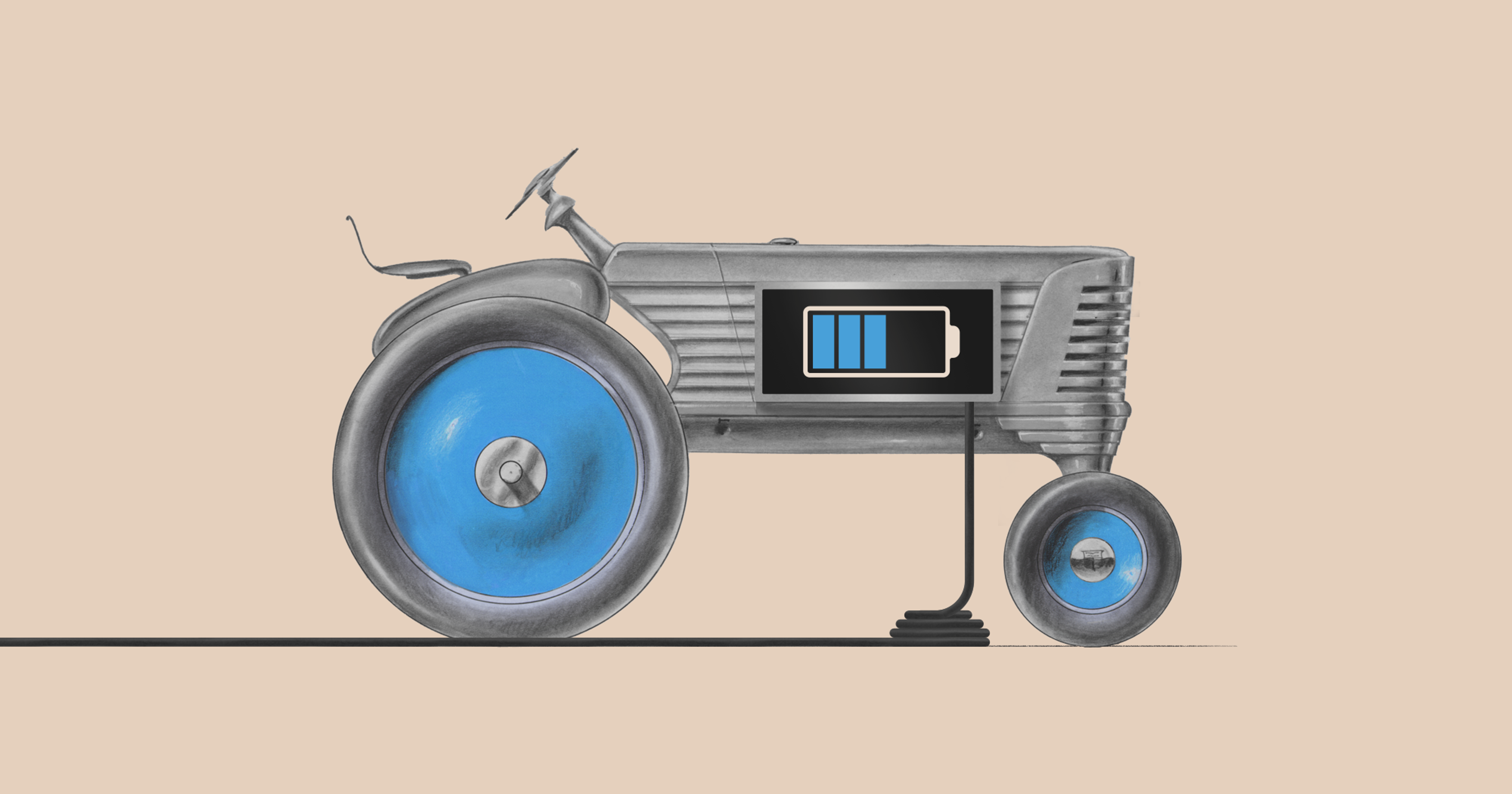
Do Farmers Dream of Electric Tractors?
I really like the art in “Do Farmers Dream of Electric Tractors?” It’s clean, simple, and nostalgic, which is a good fit for this forward-looking topic.
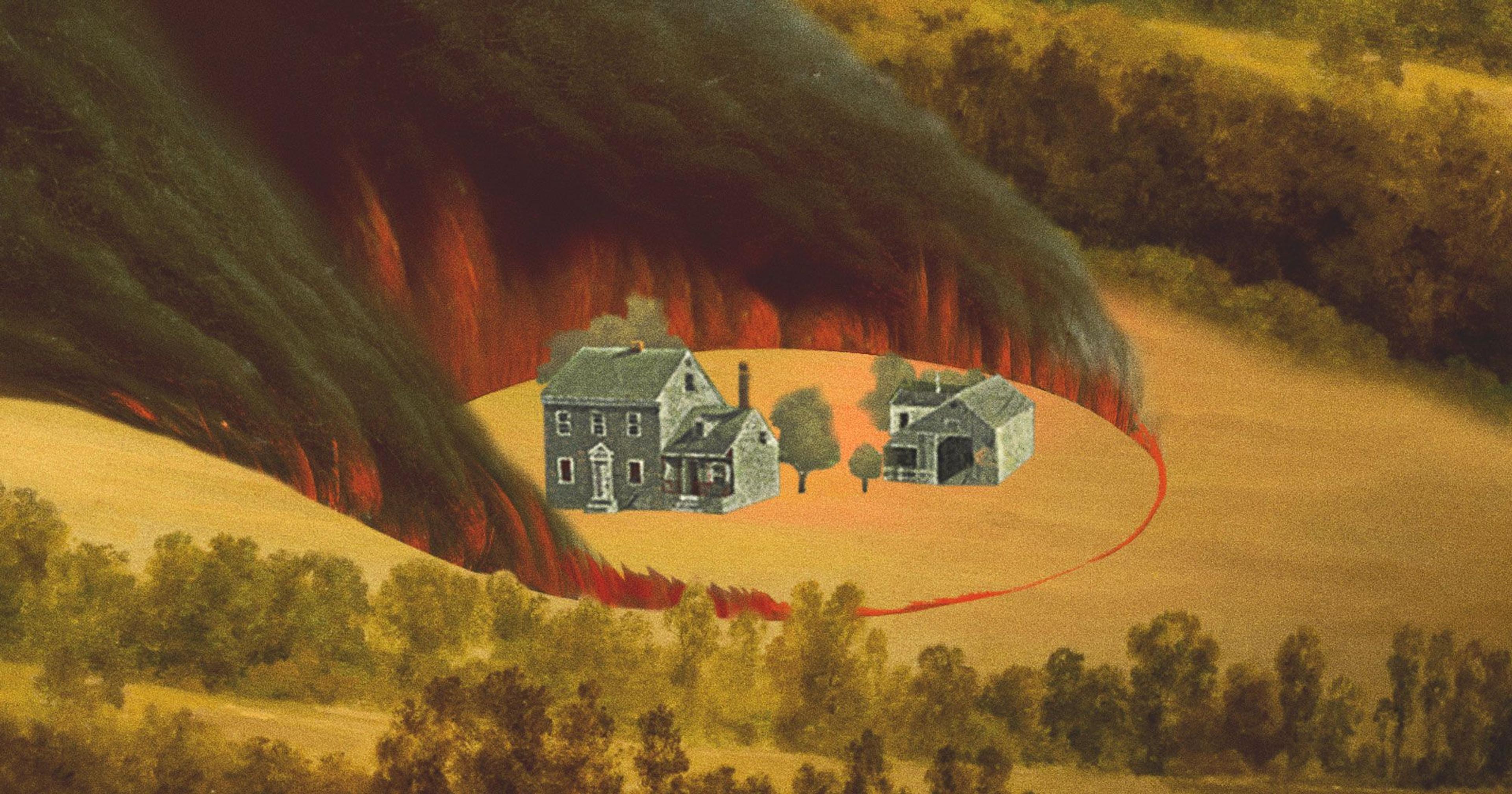
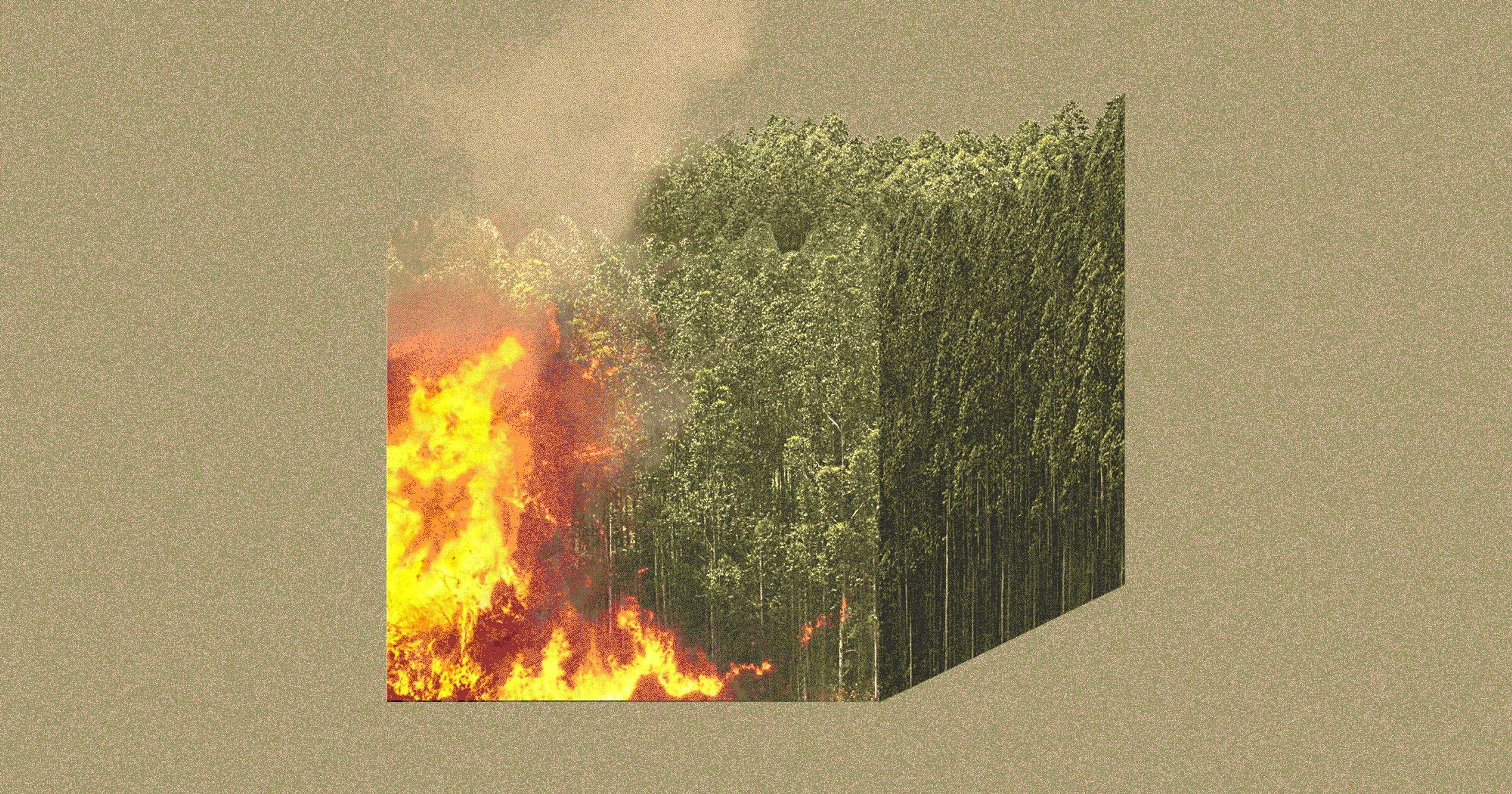
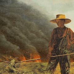
Wildfire Lessons From Texas Hill Country
I always love the surprise that comes with one of my Offrange stories going live and getting to see the art that’s been created to accompany it. This year my favorite was a sort of magical-realist illustration of flames surrounding a farm that went along with my story To Burn or Not to Burn. It was evocative, a little weird and best of all, had a corollary in another fire-related story that pubbed the same week: Wildfire Lessons From Texas Hill Country by Serina DeSalvio, which came with a very cool moving graphic of fire consuming a surreal sort of cube of trees. I loved them individually but together they were really visually striking.
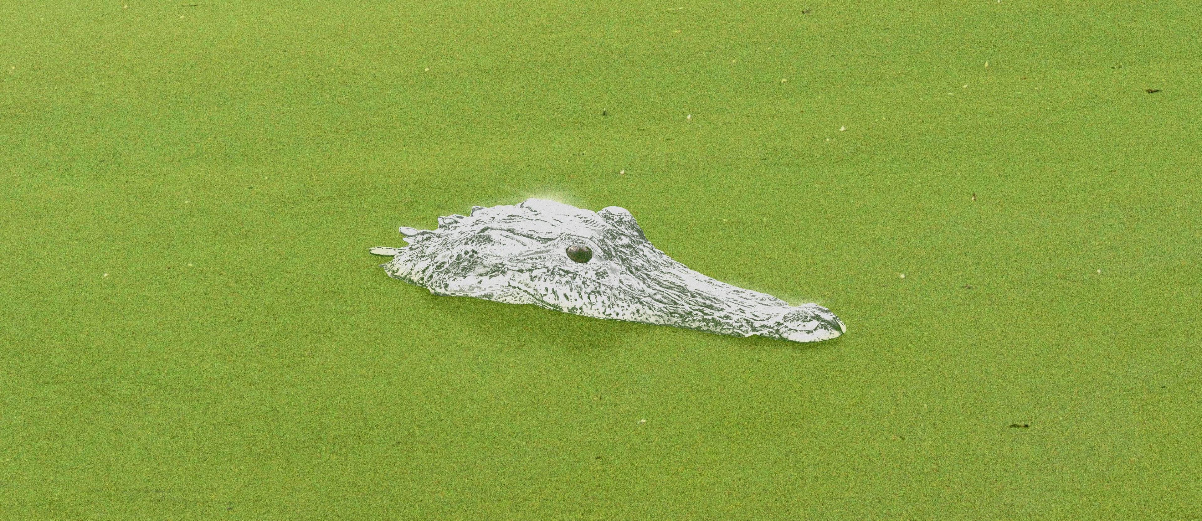
Mercury Moves Up the Food Chain
This is a very, very tough call because Adam rarely misses but I’m going to go with my gut and choose this story about mercury in American alligators. The art is creepy and murky and perfectly captures *swamp,* but it’s also bold and beautiful (my favorite shade of green) and delightfully minimalist. It’s hard not to lock eyes with that heavy-metal-riddled gator and contemplate the weight of the crimes we’ve committed against our four-legged family. Plus, that all-knowing gaze pulls you right into the story, like boots sinking into a puddle of muck.
(Editor’s Note: This was also Adam’s favorite piece of the year.)
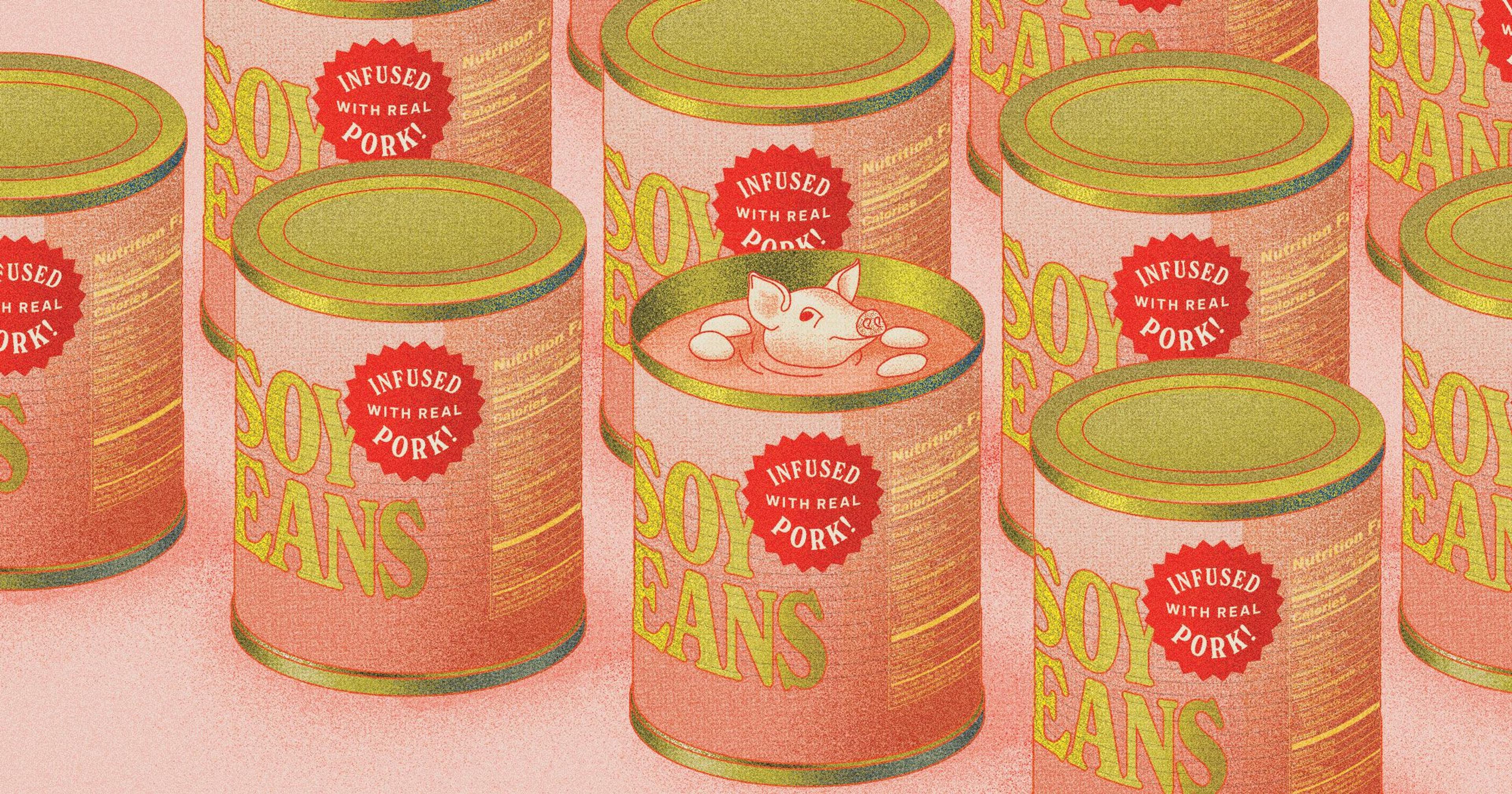
Pork-Infused Soybeans and Beef-Infused Peas
It is for a story I wrote, so I may be biased, but I truly love the art on the Pork-Infused Soybeans and Beef-Infused Peas story. The design, to me, has a retrofuturism feel that I think does a good job of highlighting the food technology angle of the story. The colors and the cans remind me of a 1950s magazine ad for canned food, with the added twist that the soybeans are infused with pork. The pig floating next to the soybeans in the center can is also such a cute touch. And, there’s something humorous/ironic to me about having a can of soy beans, which you often associate with the intentional choice NOT to eat meat, bearing a sticker that says “now infused with real pork.”
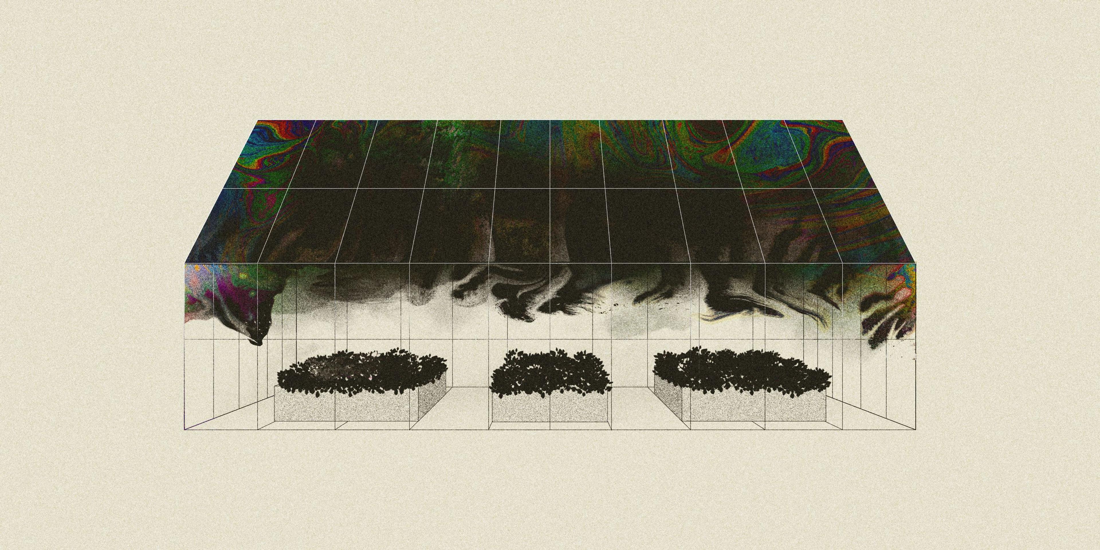
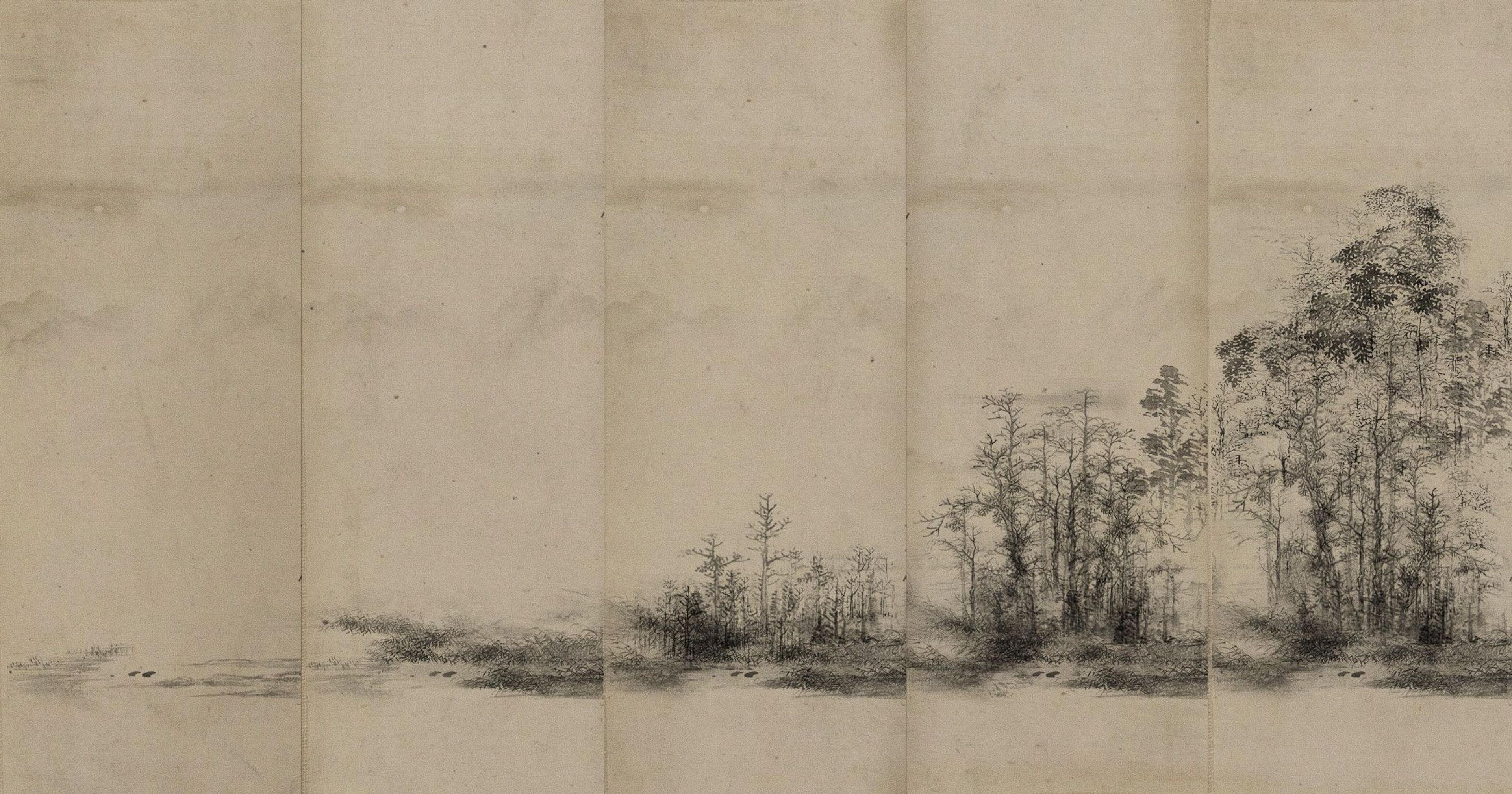
I don’t have children, but I feel like this ask is like choosing among my children. There were many excellent artworks this year in Offrange. My favorite is probably the greenhouse from Irrigating with Oil Waste, maybe because of the same type of simple treatment of the centrality of concept. My runner-up is the textured paper from Make Your Own Micro Forest, mostly as a request to Adam to play with more textures next year because they’re lovely. (Editor’s Note: Seconded on the micro forest art.)
-Mackenzie Burnett, Offrange publisher
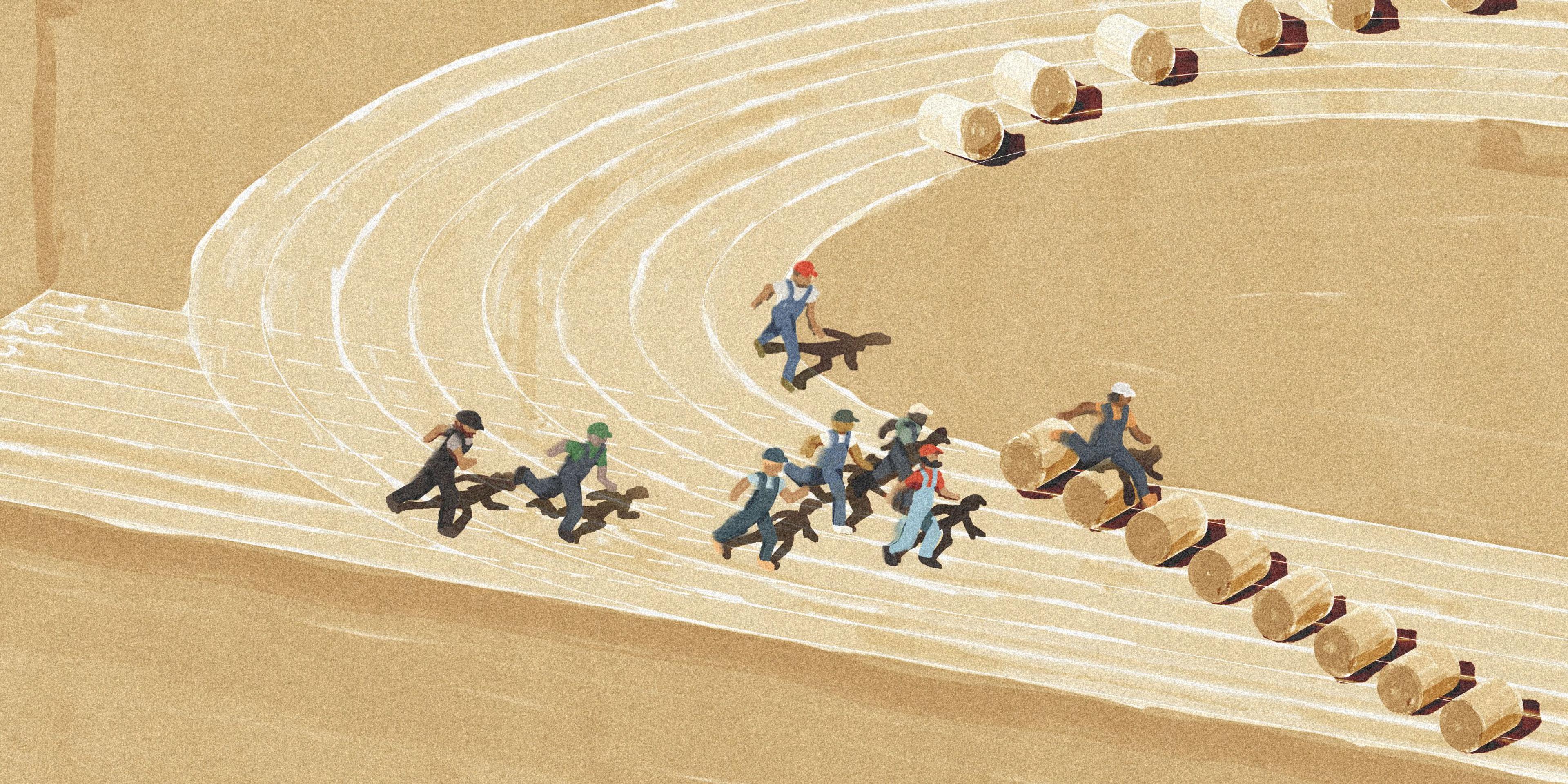
This story was nominally about the Farm Olympics, a convivial annual event in Tennessee; its true focus was on the steep challenges young farmers face in trying to acquire their own property. Adam did such a great job here using old video game aesthetics to create cheeky artwork that didn’t detract from the gravity of the subject matter.
-Jesse Hirsch, Offrange editor