As an early-stage company, it’s imperative that we build and test ideas quickly. And, with limited engineering and design resources, we want to be able to build high quality interfaces without robust design speccing or redlining each iteration. To accomplish this, we decided to invest early in a strong design system foundation, not just in our design tools, but also in code.
Investing early in our design system and maintaining parity between Figma and code base enables our engineering team to autonomously and meaningfully contribute to our product without needing a pixel-perfect mockup in every situation.
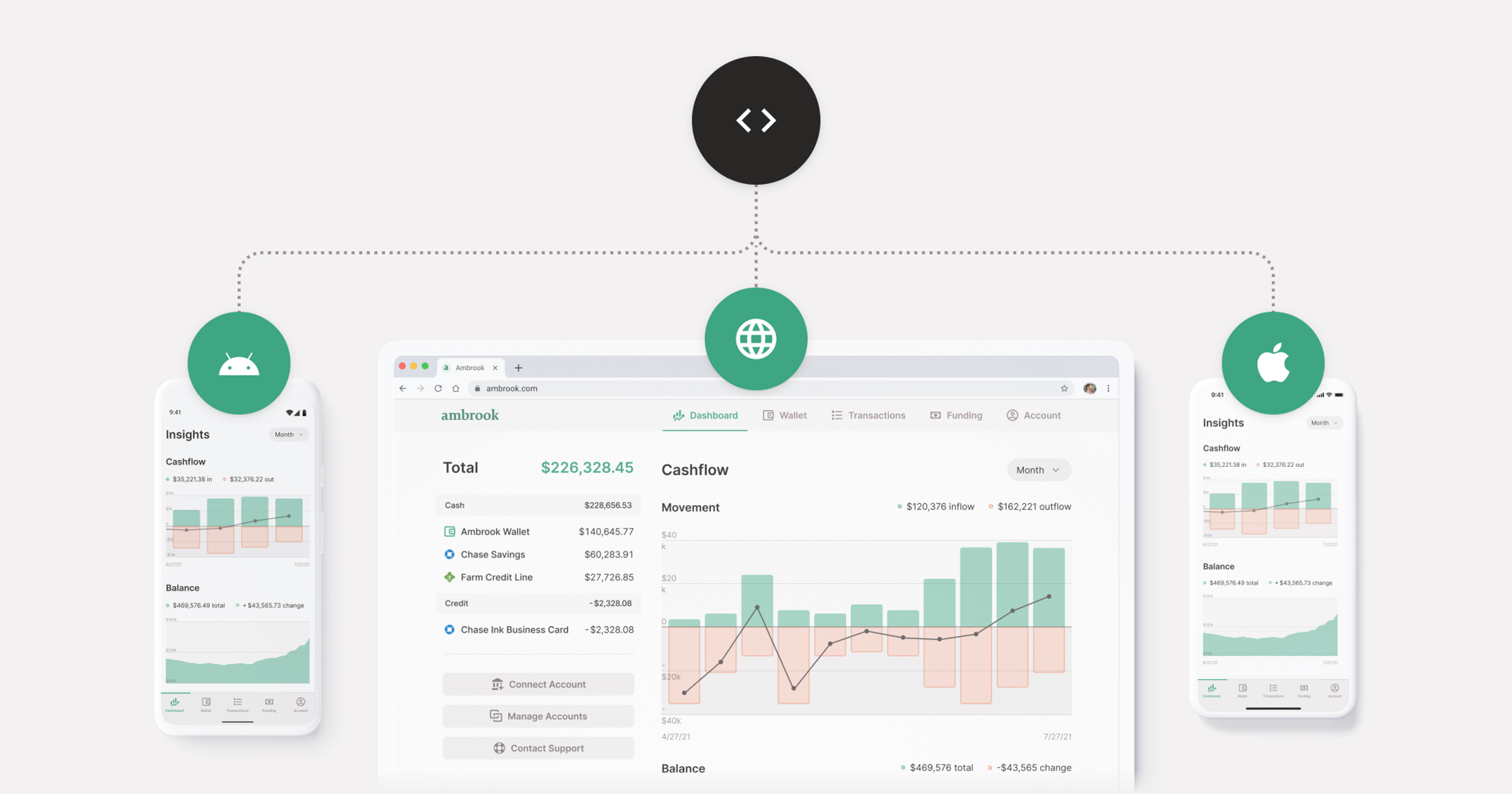
All of Ambrook’s products, from our marketing website to our Funding Library, cards and bookkeeping tools are built with these same components, written once by engineers then used everywhere. We’ve built our design system on a single design stack:
Figma components with variants for design
React, Styled Components, and Material UI on web
Storybook for visual testing
When used in concert, these design system components let us plug together high quality user interfaces without engineers having to worry about things not looking right.
It all begins in Figma
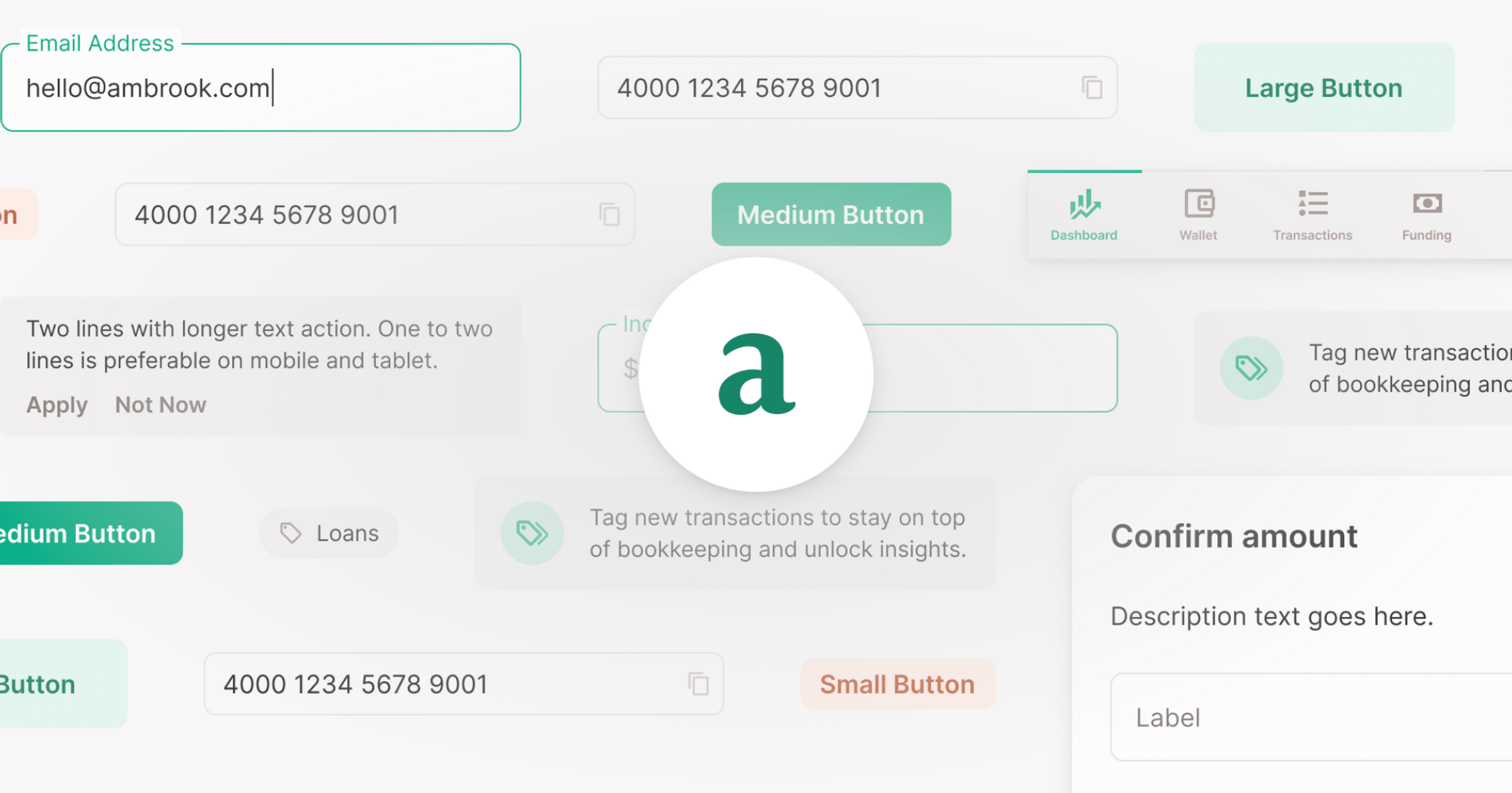
Ambrook uses Figma component variants to design consistent interfaces. With components, we can have a central style that gets reused everywhere. And, with Figma variants, we spec out what each possible combination of properties looks like, and then can select the size, color, lightness, hover state, etc from the sidebar easily. This means that when engineers see the button component, they know that it’s the same one that we have in code.
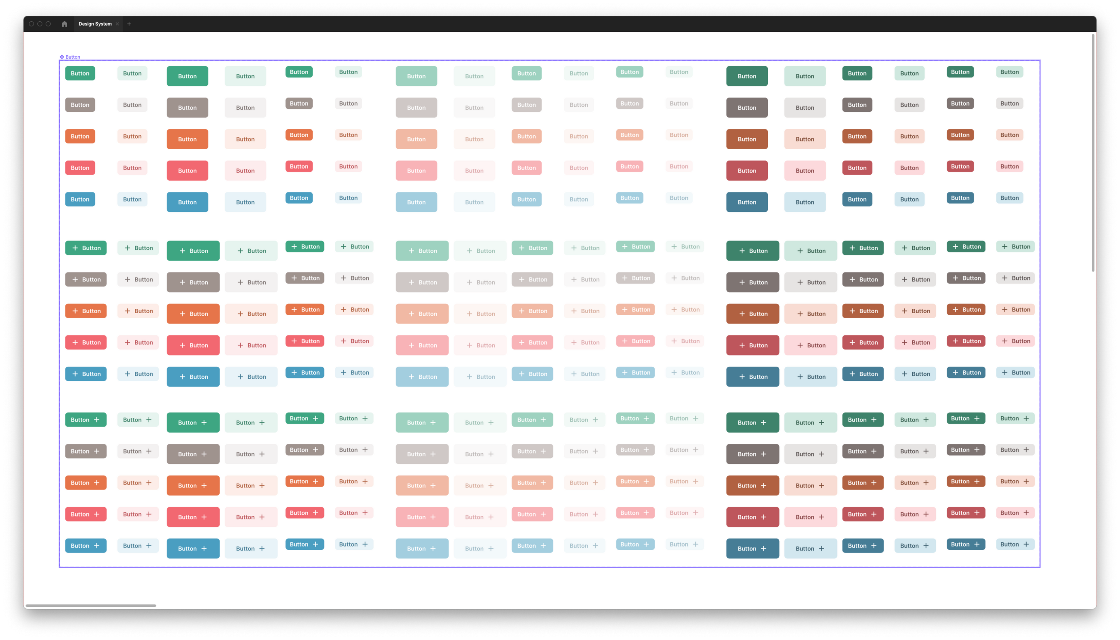
When constructing UIs in Figma, all we need to do is customize the properties of our components to construct interfaces. We use autolayout, which correlates directly with flexbox in code. When engineers view our Figma projects, they can inspect to see which components are used with what configurations, and translate that directly into React code.
Shared Code and Interfaces
Basic foundational values like colors are shared across components. Because our frontend, backend, and mobile app are all written in Typescript, these type definitions are shared across our stack.
We separate business logic and design implementation, creating an agnostic UI layer that we can use with multiple implementations per platform. This layer makes it easy for us to remove third-party dependencies like down the line if we need to optimize for performance, for example.
For each component in Figma, we define a React component that takes on similar properties to those outlined in Figma. For our button, that means size, color, light, disabled, etc. We prefix Ambrook design system components with Am, and we keep them in a frontend/design-system folder.
// frontend/design-system/buttons/AmButton.tsx
import { StyledAmButton } from './AmButton.style';
// ...
const AmButton = (props: AmButtonProps): JSX.Element => {
  // ...
  return (
    <StyledAmButton ... />
  );
};
export default AmButton;
This allows us to write easy-to-read code:
<AmButton size="large" color="blue" href="/careers" light>
Click Me
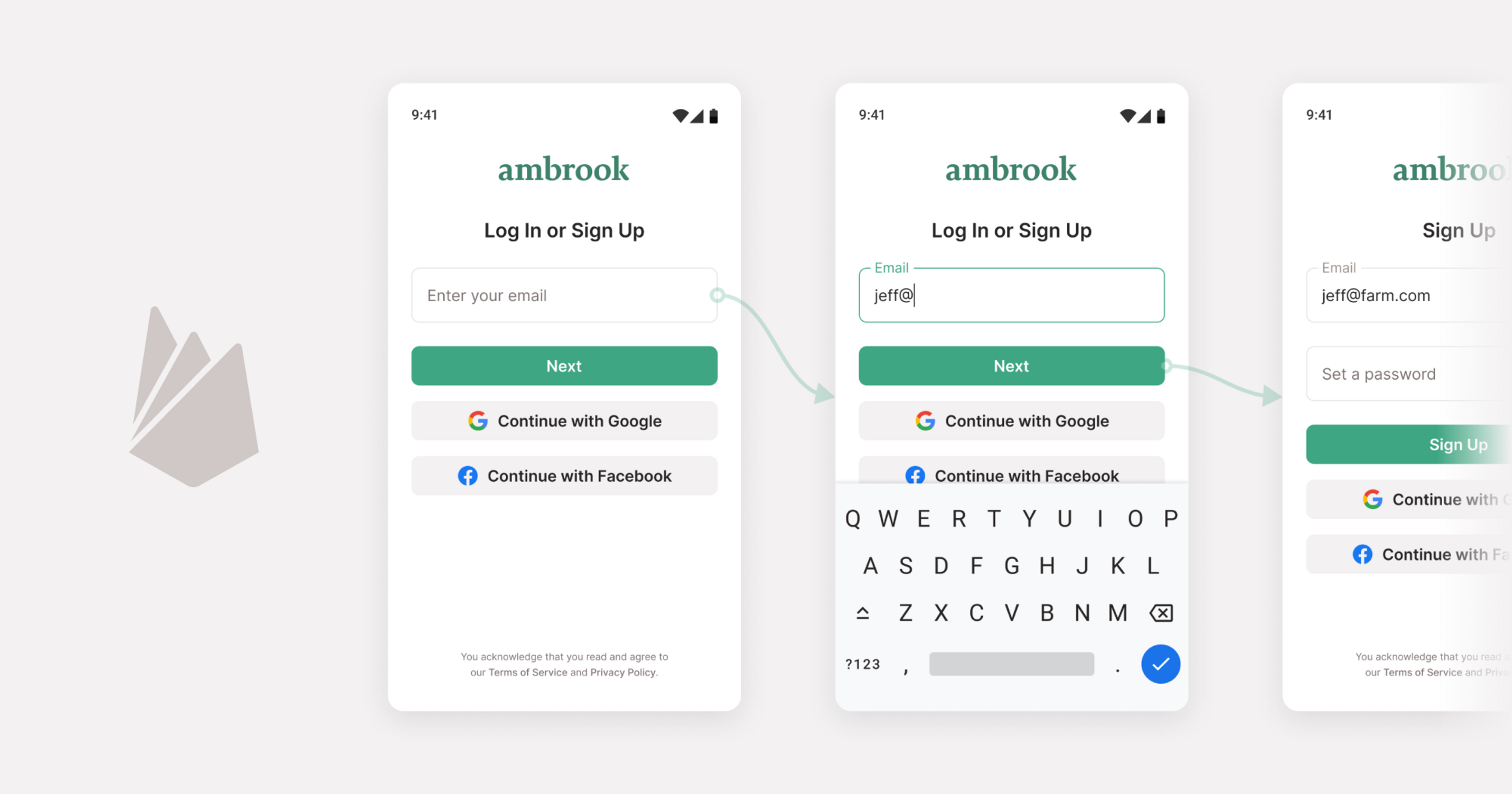
</AmButton>The AmButton component is responsible for any business logic, like support for situations where the caller passed an href (e.g. a button that is actually a link), an onClick prop (e.g. a button that submits a form), both (e.g. a button that is a link but also logs to Segment in the background), or neither (e.g. a button nested in a card which doesn’t actually do anything but passes the click event to its parent). By supporting all the different possible use cases for what a “button” can do in a single AmButton component, we ensure that all buttons look the same, regardless of what clicking them does.
Importantly, the AmButton component isn’t responsible for presentation. We have per-platform implementations, using Styled Components and Material UI on web, and React Native Paper for iOS and Android. We store these implementations in neighboring .style.tsx and .style.native.tsx files:
// frontend/design-system/buttons/AmButton.style.tsx

import Colors from 'styles/colors';
//..
export const StyledAmButton = styled(Button)<StyledAmButtonProps>`
  background-color: ${({ $color, $light }) => $light
    ? Colors[$color][10]
    : Colors[$color][50]};
  // ...
`;
The main component file is then responsible for rendering a StyledAmButton. The props prefixed with a $ will not be passed to the HTML, and will just be used within the styled component itself.
<StyledAmButton $size="large" $color="blue" href="/careers" {...moreProps} />For some design system components, we build them directly from View components or HTML elements. For more complex ones, we wrap Material UI and React Native Paper components, which offer robust style implementations like ripples and animations, as well as accessibility features out-of-the-box.
Visualizing in Storybook
In the examples above, we’ve been using a simplified version of our components. In reality, AmButton takes over 20 different props! As components become more complex, being able to verify how components are supposed to look and work in all of their variants can be difficult. To make this easier, we’re starting to use Storybook.
Storybook plugs into the type definitions for our components, and creates properties and controls that can be played with in their pre-built UI.
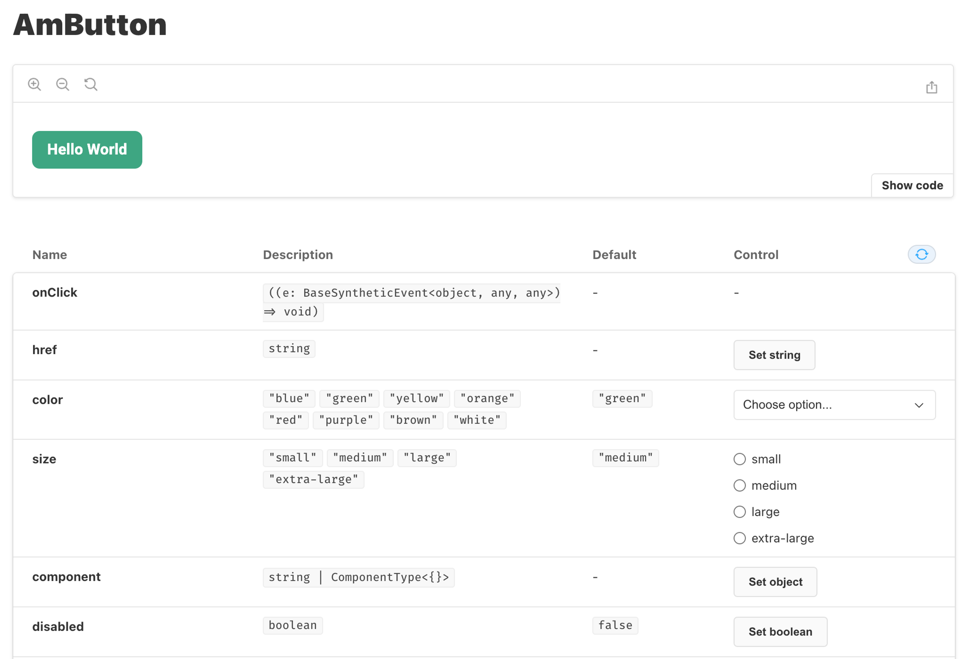
We can define stories with just a few lines of code, which reduces the maintenance effort to near-zero. We store our stories next to our components, as a neighboring .stories.tsx file. Here’s what our button stories look like:
// frontend/design-system/buttons/AmButton.stories.tsx

import AmButton, { AmButtonProps } from 'frontend/design-system/buttons/AmButton';
import { Meta, Story } from '@storybook/react/types-6-0';
import React from 'react';

export const Normal: Story<AmButtonProps> = (args) => (
  <AmButton {...args}>Hello World</AmButton>
);

export const WithStartIcon = Normal.bind({});
WithStartIcon.args = { ...Normal.args, startIcon: <Decagram /> };

export const WithEndIcon = Normal.bind({});
WithEndIcon.args = { ...Normal.args, endIcon: <ArrowRight /> };

export default {
  component: AmButton,
  title: 'Components/AmButton',
} as Meta;
Our storybook components allow us to play around with the possible properties that can be provided to a component, and see how they interact.
Moving Fast
Bringing our design system into code takes time up front, as well as maintenance along the way. But so far, our investment has paid off, letting us experiment and iterate on our product without worrying about getting the design details right.