We mapped all the farmland in the US by its ratio of land cost to expected agricultural value.
While great strides in technology have made it possible to grow food indoors and in otherwise occupied spaces, the vast majority of farming requires land—and a lot of it. In the US, the agricultural sector is going through a time of succession with an aging farming population looking to sell or lease their land to younger generations. Whether due to this demand or other market forces, farmland has been rising meteorically in price. In real terms, farmland in the US has doubled in value in the last 20 years—from an average of $1,500 per acre to $3,000. We examined publicly available data from the USDA to examine how farmland is distributed and to map out where the cost of farmland is best justified by its expected agricultural output.
Where do farms already exist?
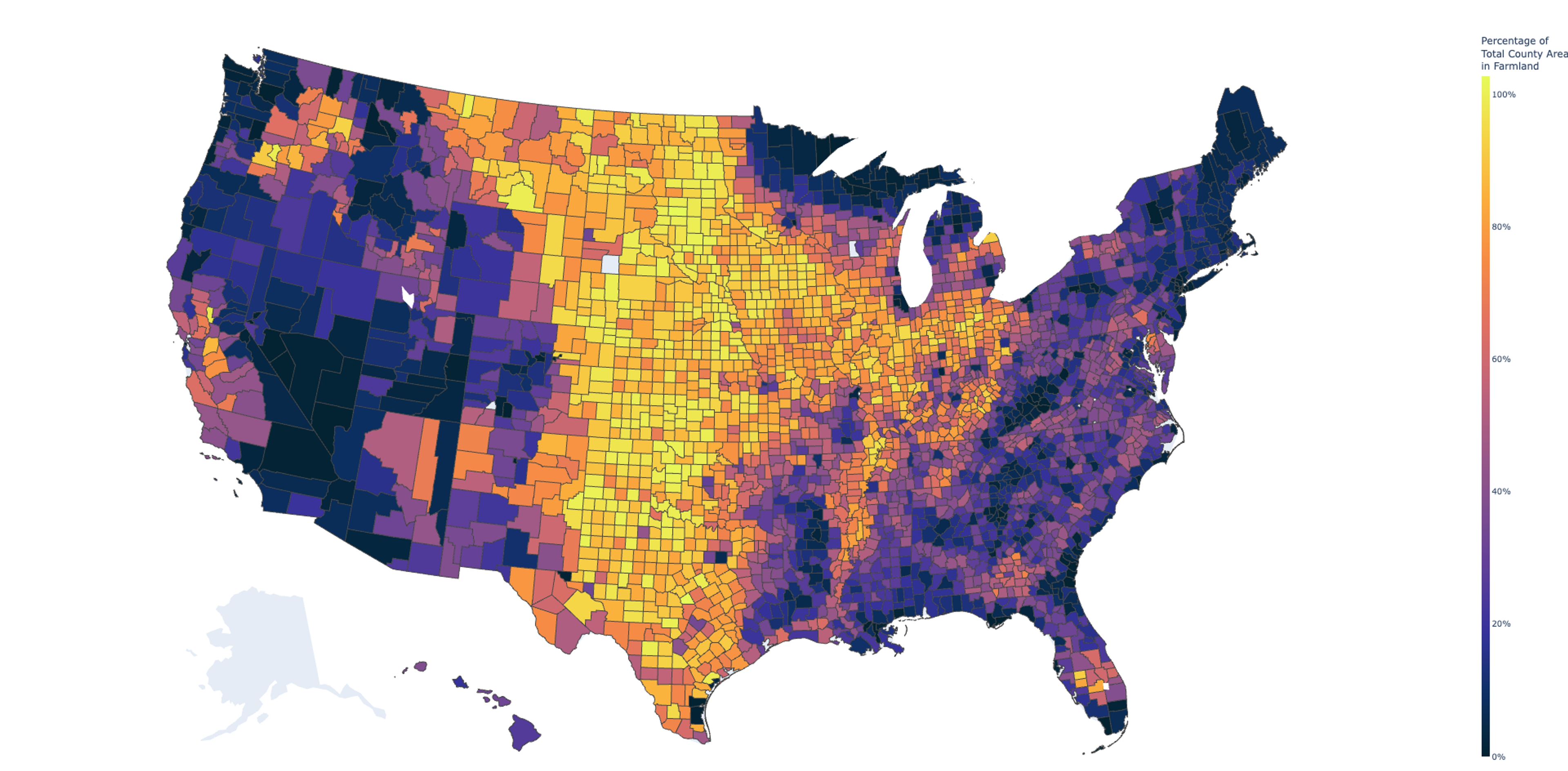
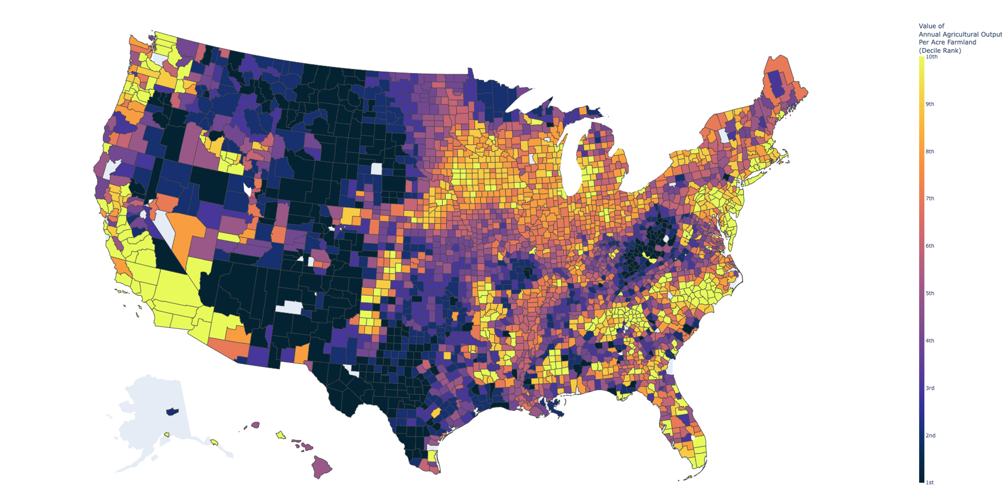
The distribution of farmland in the United States has been driven by complex factors such as soil quality, population density, policy, and the availability of irrigation technology. The map we see today is the result; the vast majority of intensively farmed counties are in the middle of the country, with smaller regions of intensity on the East and West Coasts. When examining the distribution of farms by agricultural value per acre, we see a more even distribution of farming across the country, with gaps only in the most mountainous and arid regions.
While farmland value is certainly driven by its agronomic attributes, such as soil health and climate, the price of farmland is often related to factors that have nothing to do with agriculture. For example, a plot of farmland near a city has more value because it could be turned into a high-value residential neighborhood. Thus, a hypothetical new farmer with no preference about where they want to start farming should locate a parcel of land whose price is not inflated by non-agricultural influences. That’s not to say being near an urban area has no agricultural value. It is well-documented that proximity to an urban area can help a farmer’s bottom line through reduced transport costs and access to a premium-priced market. We’re going to look for those places using a ratio of the annual value of a county’s agricultural produce to its raw land value.
A Ratio of Land Cost to Annual Agricultural Revenue
The National Agricultural Statistics Service ( NASS) routinely gathers farmland statistics, and its most robust data comes from the bidecadal Census of Agriculture (AKA Ag Census). We retrieved the following data from the 2017 Ag Census the following data:
| Name | Description | Unit |
|---|---|---|
| Value of Agricultural Land and Buildings | Current expected market value of farmland and buildings | Dollars per Acre in County ($/Acre) |
| Total Acres of Agricultural Land | All acres of land used for agricultural purposes in the county. | Land area per County (Acres) |
| Revenue from Agricultural Operations | Gross market value of produce before taxes and production expenses of all agricultural products sold | Dollars per County ($) |
| Net Income of Agricultural Operations | Net Income of farm after operating expenses | Dollars per County ($) |
We further constructed the below variables from that data:
| Name | Description | Unit |
|---|---|---|
| Percentage of County Acreage used for Agriculture | County Acreage in Farms divided by County Total Acreage | % |
| Revenue from Agricultural Operations per Acre | Revenue from Agricultural Operations per county divided by the number of acres of agricultural land in that county. | Dollars per Acre per Year ($/Acre-Year) |
| Net Income from Agricultural Operations per Acre | Net Income from Agricultural Operations per county divided by the number of acres of agricultural land in that county. | Dollars per Acre per Year ($/Acre-Year) |
And finally we arrive at the ratios of interest:
| Name | Description | Unit |
|---|---|---|
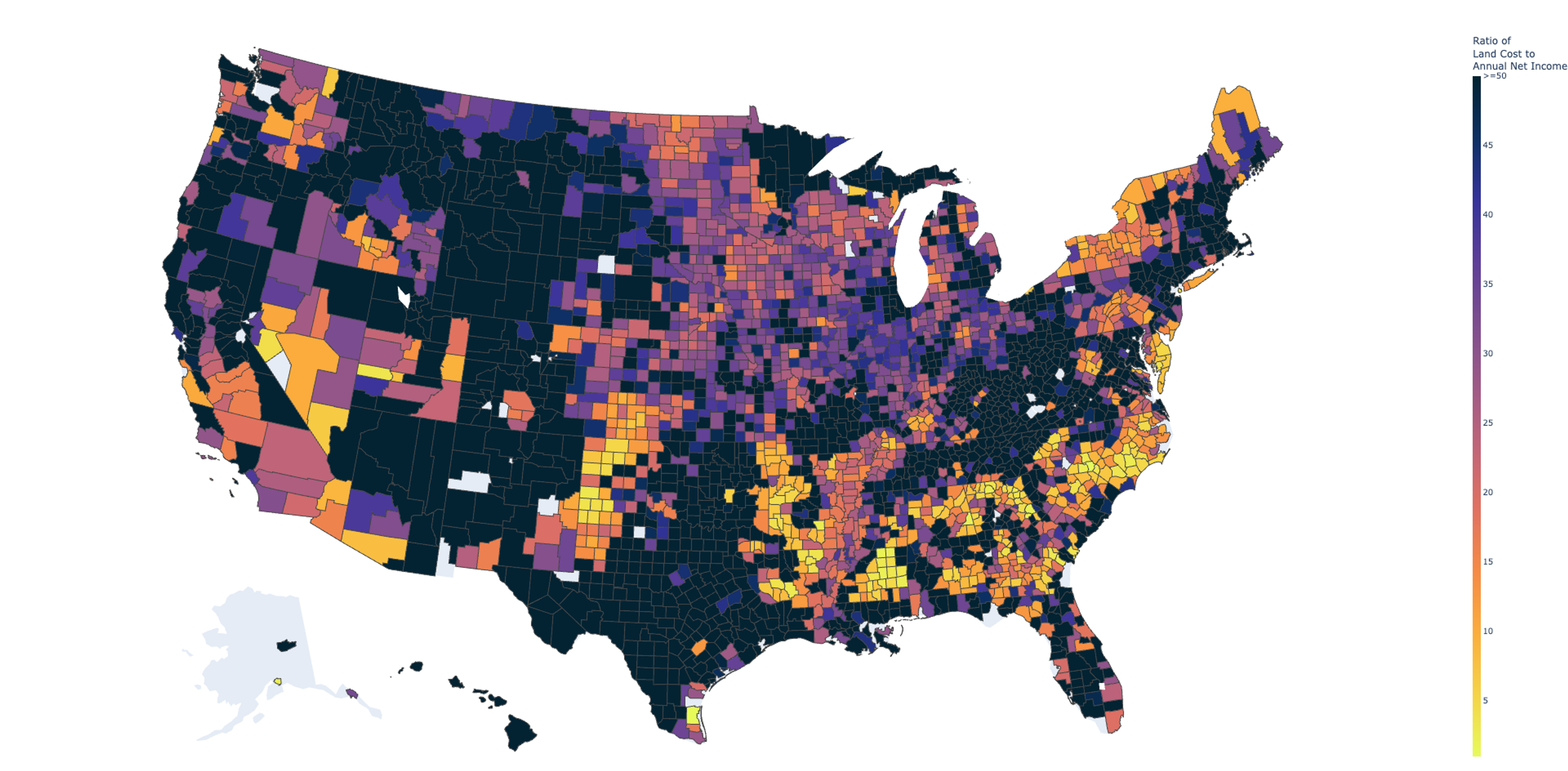
| Land Value to Annual Revenue | Value of Agricultural Land and Buildings divided by Annual Revenue from Agriculture | Unitless. Meaningful only for comparison across counties. |
| Land Value to Annual Net Income | Value of Agricultural Land and Buildings divided by Annual Net Income from Agriculture | Unitless. Meaningful only for comparison across counties. |
Through mapping these ratios, we can identify counties where the value of the land’s expected agricultural output is high relative to its cost—in essence, where you can get the biggest bang for your buck if all you care about is profitable farming.
Mapping the Ratio
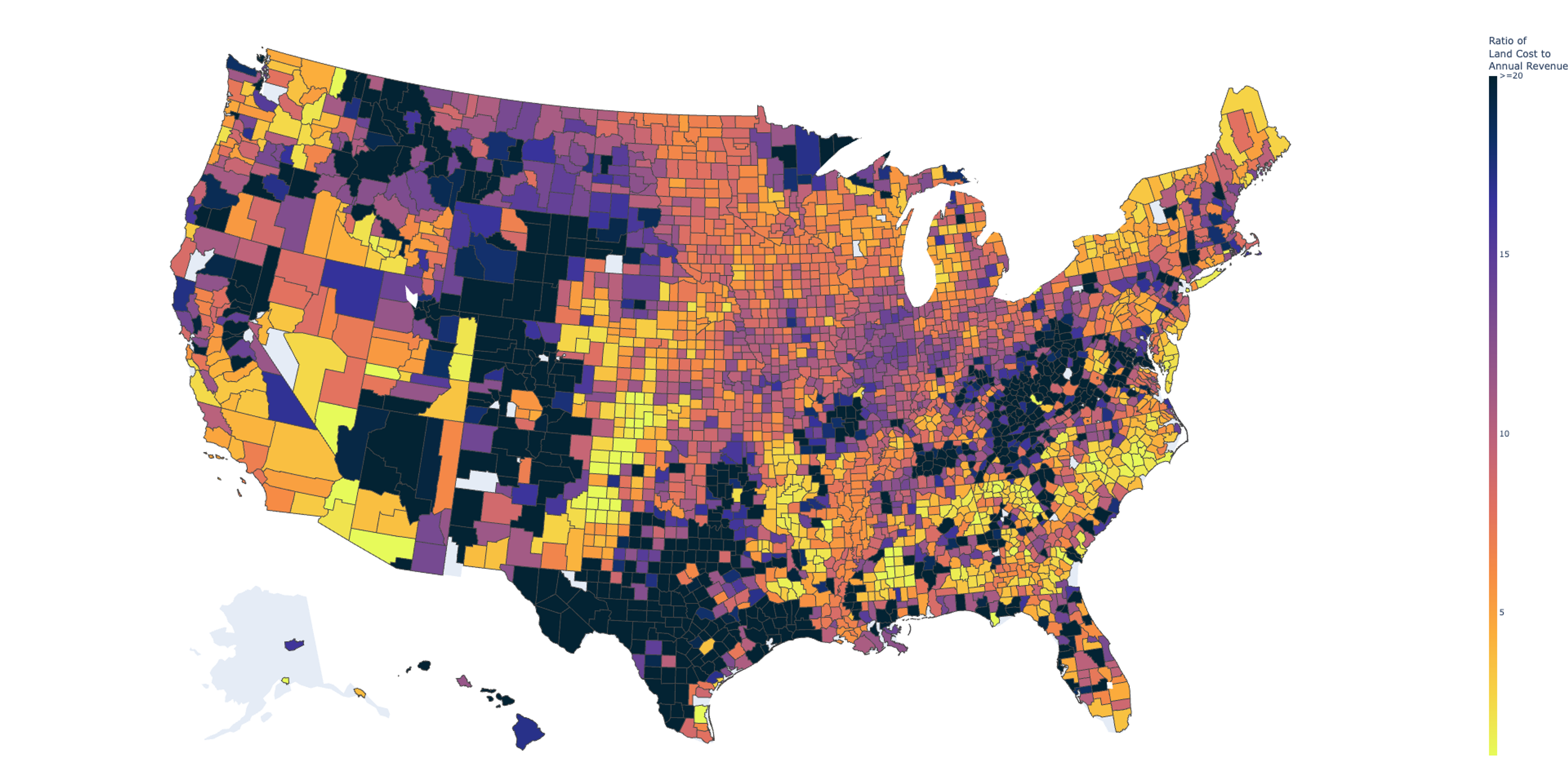
Considered on its own, Figure 2 is a way to visualize a cost-benefit analysis of buying land in one of these counties for agricultural production. Table 1 below shows the top 5 counties in the US with the lowest ratio—where the cost of land is very cheap relative to average annual agricultural revenue:
| County | Ratio of Land Cost to Rev. | Land Cost ($/Acre) | Total Farmland (Acres) | Annual Rev. ($/Acre) |
|---|---|---|---|---|
| Kenedy, TX | 0.09 | $737 | 2,452 | $8,036 |
| Richmond, NC | 0.29 | $4,365 | 12,435 | $15,213 |
| Haskell, KS | 0.48 | $1,527 | 363,751 | $3,187 |
| Clark, NV | 0.52 | $3,109 | 2,130 | $5,939 |
| Beaver, UT | 0.55 | $2,226 | 63,597 | $4,057 |
Exploring Figure 2 above shows a pretty similar pattern to Figure 1, but it’s where these two maps differ that are the most interesting. If a county is in the upper deciles of agriculture revenue per acre (brightly colored in Figure 1), but its land cost to revenue ratio is still high (darkly colored in Figure 2) that could indicate the land value is being driven up by non-agricultural factors. Conversely, if a county is in the middle or lower deciles of agriculture revenue per acre (darkly colored in Figure 1), but its land cost to revenue ratio is low (brightly Colored in Figure 2) then it may be a place to find land that is not attractive to, and therefore not priced for, non-agricultural uses.
We can find the biggest of these divergences by ranking each county by these two measures, and finding the counties with the biggest differences across the two rankings. For example, Napa County (the biggest agricultural county in Table 3 below), is ranked 147th of all counties for Annual Revenue per Acre, but falls to 2495th when land cost is considered. This is a tumble from the Top 5% to the bottom 20%. In Table 2, we see the hidden gems—counties that are not attractive when looking at revenue per acre, but become much more attractive relative to their cost of land.
| County | Rank Change | Annual Rev. ($/Acre) | Ratio of Land Cost to Rev. | Annual Rev. Rank | Ratio of Land Cost to Rev. Rank |
|---|---|---|---|---|---|
| San Juan, UT | 2,213 | $107 | 3.43 | 2,549 | 336 |
| Lea, NM | 2,131 | $99 | 4.15 | 2,589 | 458 |
| Chaves, NM | 2,020 | $174 | 2.71 | 2,249 | 229 |
| Apache, AZ | 2,007 | $43 | 6.35 | 2,881 | 874 |
| Luna, NM | 2,001 | $138 | 3.74 | 2,392 | 391 |
| County | Rank Change | Annual Rev. ($/Acre) | Ratio of Land Cost to Rev. | Annual Rev. Rank | Ratio of Land Cost to Rev. Rank | |
|---|---|---|---|---|---|---|
| Philadelphia, PA | -2,555 | $1,287 | 45.60 | 331 | 2,886 | |
| Bristol, RI | -2,420 | $1,875 | 24.05 | 183 | 2,603 | |
| Napa, CA | -2,348 | $2,241 | 19.70 | 147 | 2,495 | |
| Passaic, NJ | -2,283 | $1,512 | 21.13 | 252 | 2,535 | |
| Nantucket, MA | -2,156 | $2,536 | 15.43 | 120 | 2,276 |
With the below tool, you can explore these comparisons visually:
State Comparison Tool
Limitations
NASS surveys only active farmland, so this map will not capture the potential of land that was not reported as part of a farm in 2017. Similarly, the revenue and net income measures reflect the type of agriculture that existed at the time of the survey. It may be that a farmer could take land in one of these counties and make more revenue by growing different crops or applying different farming techniques.
Furthermore, farmland has an incredible breadth of variation even on the acre-level of granularity, so the county-level average ratios presented here will not accurately represent every parcel within the county and they won’t express the other local issues of an area. For example, a number of New Mexico counties appeared on our Top 5 list (Table 2) above; our further research showed that those counties’ farmers and ranchers are not worried about land costs, but they are worried about where their water is coming from season to season. In the opposite direction, New Jersey farmland is extremely expensive, but the state has a very attractive tax structure for agricultural businesses that has allowed farming to stay there. An aspiring farmer should take this map as an invitation to look at counties with low land-cost-to-revenue ratios but applying due diligence to any particular parcel will remain essential.
Conclusions
Choosing where to buy land to start a farm is rarely a decision driven only by a profit motive, but farmland seekers should consider whether they are paying for non-agricultural drivers of land value. The tools and maps presented here have attempted to provide a preliminary filter to determine which regions are relatively better priced for their productive potential.